Preview image. Unlock full-res
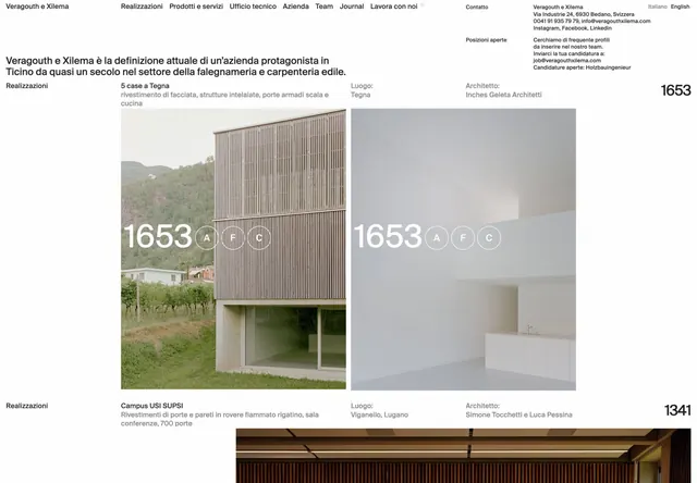
Architecture studio website showcasing timber-and-concrete residential projects with paired photography and numeric project references.
Summary
Architecture studio website showcasing timber-and-concrete residential projects with paired photography and numeric project references.
Visual description
A full-width portfolio layout displays two symmetrical project photographs side by side, each labeled with a large numeric identifier (1653 on the left, 1653 on the right) in cream sans-serif. The left image shows a contemporary timber-clad residential structure nestled in a hillside landscape with vineyards. The right image depicts an interior wall with minimalist white shelving. Small circular icon buttons float beneath each project number, allowing navigation. Below the photo pair, typography-only sections list project metadata in a hierarchy of sans-serif sizes: location names (Tegna, Lugano), architect credits (Inches Geleta Architetti, Simone Toccetti e Luca Pessina), and a second set of projects (Campus USI SUPSI, numbered 1341). Header navigation at the top presents menu items in quiet gray sans-serif (Realizazioni, Prodotti e servizi, Ufficio tecnico, Azienda, Team, Journal, Lavora con noi) alongside language toggles (Italiano, English). Footer contact information in tiny type. The palette relies on cream, light gray, dark gray, and warm taupe tones, letting photography dominate while type provides subtle structure.
Key takeaway
The numeric labeling system creates a filing-like quality that feels both systematic and elegant. Pairing large photography with secondary text treatments prevents the layout from feeling text-heavy. The restrained color palette (creams and natural stone tones) serves as a neutral frame that lets architecture photography speak. Icon buttons for project navigation provide interaction cues without visual noise.
Reuse notes
Strongly suited to architecture, interior design, and luxury goods portfolios where craft and precision matter. The cream-on-gray palette conveys sophistication and permanence. Works well for studios wanting to emphasize their work over their marketing copy. Consider this approach when the visual assets (photography) are of consistently high quality and can carry the narrative.
More like this


Keep what you find
A free account saves references to boards and can send you a weekly email of picks based on what you save.
To see every result, go Pro.