Preview image. Unlock full-res
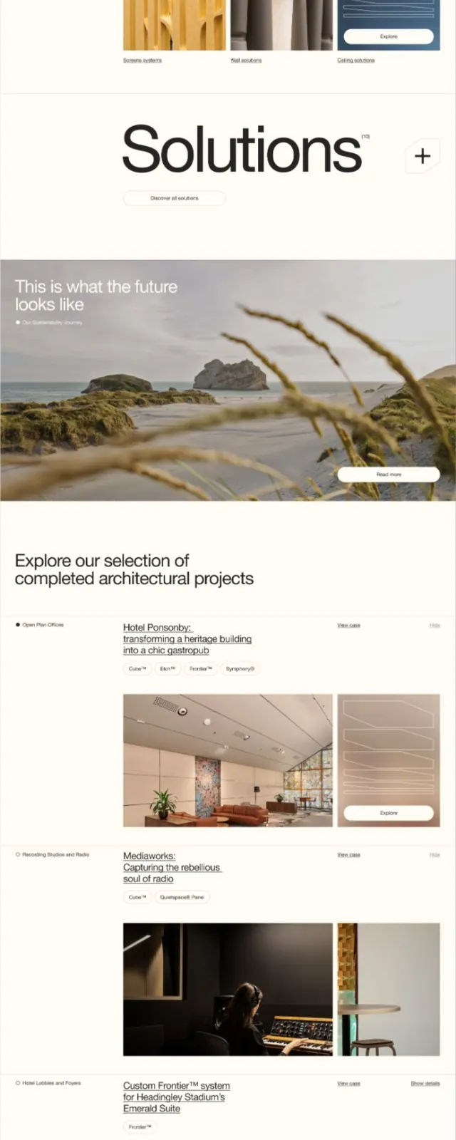
Multi-section landing page for an acoustics company, pairing hero, feature showcase, solutions, and project portfolio in a warm, earthy palette.
Summary
Multi-section B2B landing page for acoustic solutions, combining earthy photography with minimal sans-serif typography to convey both product sophistication and approachability.
Visual description
Full-page website layout with warm, neutral palette dominated by creams, warm greys, and dark brown. Hero section features large white sans-serif headline set over an interior architectural photograph with warm incandescent lighting. Below, a three-column product showcase uses close-up material photography (wood slats, textured surfaces, acoustic panels in blue tones) with short labels. A large "Solutions" section divider is followed by lifestyle imagery ("This is what the future looks like") with coastal landscape photography and minimal white overlay text. Lower sections show completed project case studies (hotel, media, custom interiors) with thumbnail images and descriptive metadata. Final section features a dark background with a circular logo mark. Navigation appears clean and sparse at top.
Key takeaway
Strong use of material and architectural photography grounded by minimal typography creates premium positioning without excess decoration. Warm/cool color contrast between earthy neutrals and blue-toned acoustic panels draws attention naturally. Multi-section layout hierarchy uses white space and scale shifts rather than heavy borders or dividers.
Reuse notes
Works well for B2B service/product companies (architecture, materials, manufactured goods, interior design, acoustics, furniture). Pairs well with photography-heavy brands. Warm palette signals approachability; minimal sans-serif maintains professional credibility. Long-form suitable for enterprise buyers doing category research.
More like this



Keep what you find
A free account saves references to boards and can send you a weekly email of picks based on what you save.
To see every result, go Pro.