Preview image. Unlock full-res
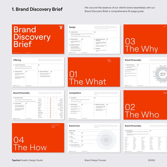
Modular grid layout for brand discovery documentation, pairing bold burnt-orange card covers with light gray content pages.
Summary
Nine-panel grid template for a brand discovery brief, with large burnt-orange section cards (01 The What, 02 The Who, 03 The Why, 04 The How) interspersed with light gray pages of detail content and charts.
Visual description
Cream background holds a 3x3 grid of nine distinct panels. Large burnt-orange cards occupy four positions, each featuring bold white sans-serif numerals and section titles (01 The What, 02 The Who, 03 The Why, 04 The How), with a small red X icon in the upper right. The remaining five panels are light gray or beige, showing wireframe content blocks, small text, minimal spot charts, and structural hints of what content belongs inside. The header at top left reads "1. Brand Discovery Brief" in small dark text. Footer shows "Brand Strategic Phases" and a date stamp. The overall effect is a template scaffold showing both the visual framework and the information architecture of a brand strategy document.
Key takeaway
The alternating grid rhythm of visual anchors (bold orange cards) and content depth (gray detail pages), which breaks up dense information while maintaining cohesion. Using section numerals and simple labels (The What, The Who) as a pattern for stakeholder storytelling. The small visual grammar (icons, spot charts, wireframe hints) clarifying structure without overwhelming the layout.
Reuse notes
Perfect for design and branding agency processes, pitch decks, and brand strategy documentation templates. The burnt-orange and gray palette signals warmth paired with professional rigor. Works best when presenting discovery, strategy, or planning frameworks to clients. Scale well for PDFs, printed decks, and interactive digital presentations.
More like this




Keep what you find
A free account saves references to boards and can send you a weekly email of picks based on what you save.
To see every result, go Pro.