Preview image. Unlock full-res
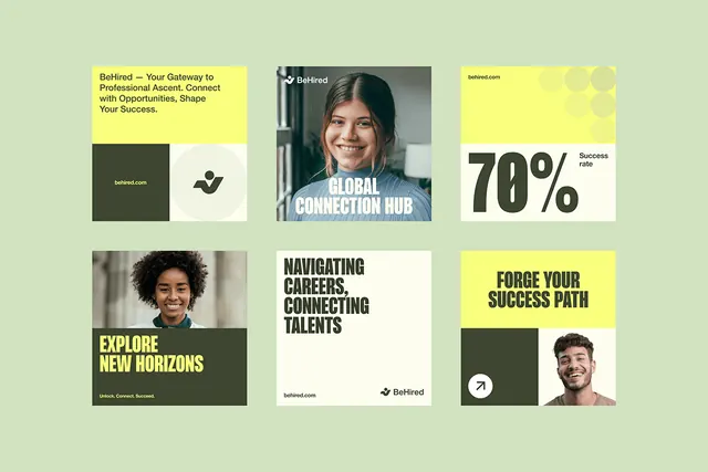
A recruitment and career-development platform layout using a soft sage-green background, chunked grid cards with contrasting highlight colors, photography, and bold typography to communicate trust and opportunity.
Summary
A recruitment platform landing page organized as a modular 3x2 card grid on a soft sage-green background, with alternating photography, color-blocked typography cards, and stat displays to highlight career opportunities and platform services.
Visual description
The background is a soft, muted sage green. The grid arranges six distinct card modules: (top left) a yellow card with BeHired headline and tagline text; (top center) a gray-toned photo of a smiling professional with "GLOBAL CONNECTION HUB" overlaid in white caps; (top right) a bright yellow card displaying "78%" in oversized olive-green numerals with "Success rate" label; (bottom left) a two-part card with a portrait photo and an olive-green block containing the yellow headline "EXPLORE NEW HORIZONS" with tagline; (bottom center) a white card with bold all-caps black headline "NAVIGATING CAREERS, CONNECTING TALENTS" and BeHired branding; (bottom right) another split card with a yellow block and olive-green section containing a portrait photo and a circular icon. Typography is clean, modern sans-serif throughout.
Key takeaway
The alternating color-block and photography pattern creates rhythm across the grid without heavy borders or dividers. Bright yellow accent rectangles punch against the muted sage background, drawing focus to key value propositions. Overlaying large-scale sans-serif headlines (78%, EXPLORE NEW HORIZONS) on cards creates visual hierarchy and emotional engagement. The grid is strict but card internal layouts vary (photo + text, stat + label, headline only), preventing monotony.
Reuse notes
Excellent for B2B platforms, recruitment sites, and educational services where you need to present multiple distinct offerings with equal visual weight. The color palette feels approachable and trustworthy; the bold typography conveys confidence without aggression. Works well when each card represents a distinct feature or benefit. Sage green and muted neutrals are well-suited to professional services; swap the yellow for a different brand accent if needed.
More like this




Keep what you find
A free account saves references to boards and can send you a weekly email of picks based on what you save.
To see every result, go Pro.