Preview image. Unlock full-res
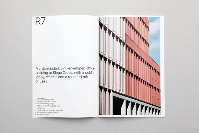
Two-page architectural branding spread for a pink-facade office building (R7 at Kings Cross), with specification copy on the left and a bold photograph of the building's repetitive brise-soleil on the right.
Summary
Two-page architectural marketing spread for R7, a pink-enveloped office complex at Kings Cross, pairing tight specification text on the left with a dramatic photograph of the building's geometric brise-soleil shading system on the right.
Visual description
A left-right two-page layout on a light grey background. The left page is mostly white, set flush left and top, with the project identifier "R7" in thin, large sans-serif caps, followed by a short description: "A civic-minded, pink-enveloped office building at Kings Cross, with a public lobby, cinema and a rounded mix of uses." Below, a bulleted specification list in small sans-serif outlines key features (BREAM Outstandinge, multiple tenanted offices, dimensions, access, public realm, cinema, bike spaces). The right page features a color photograph cropped at an angle, showing the building's facade: a striking salmon-pink brick wall with closely-spaced, diamond-shaped brise-soleil fins casting dramatic shadows. Below the fins, white vertical cladding creates a secondary rhythm. Blue sky visible in the corner. The photograph fills the entire right panel, emphasizing the architectural detail and materiality.
Key takeaway
The dramatic angle of the photograph (not straight-on) makes the repetitive geometry feel dynamic and sculptural. The specification list is tight, left-aligned, and non-decorative, avoiding the jargon soup that often buries real-estate marketing. The color contrast (pink building on pale paper) is crisp and memorable.
Reuse notes
Highly effective for architectural practices, real-estate development marketing, and civic/institutional building branding. The close-cropped photograph of a facade detail (rather than a hero shot of the whole building) works best when the detail is genuinely interesting or novel. The layout assumes you have compelling typography and a strong spec list; generic space descriptions will dilute the impact. Pink works here; avoid forcing a bold color if it does not reflect the building's actual appearance.
More like this



Keep what you find
A free account saves references to boards and can send you a weekly email of picks based on what you save.
To see every result, go Pro.