Preview image. Unlock full-res
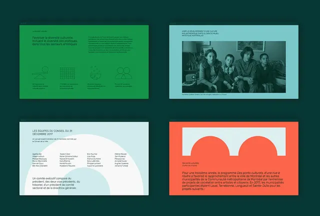
Four-panel layout showcasing a nonprofit cultural identity in teal, light cyan, and coral, mixing icon systems, photography, and typographic components.
Summary
A four-panel identity system for a French cultural nonprofit mixing teal, cyan, and coral accent colors with clean sans-serif typography and minimal iconography to organize information hierarchically.
Visual description
Top-left panel: bright teal background with French copy and a four-icon row showing organizational structure via outlined symbols (people groups, dots pattern, pie chart, network nodes). Top-right panel: light cyan with photograph of five people in period costume, French title text above. Bottom-left panel: light background with team names in two columns and descriptive text, accented by an organic cream-white curved shape. Bottom-right panel: coral background with two large overlapping circles and French body copy in sans-serif. All panels use consistent margins and typography, aligning to a clear layout grid.
Key takeaway
The color system using deep teal primary with light cyan and coral as complementary accents creates visual distinction without clutter. Icon row translates organizational data into scannable shapes. The curved organic accent shape breaks grid rigidity while maintaining professionalism.
Reuse notes
Strong reference for nonprofit identity systems, cultural organizations, or governance comms where multiple stakeholders need visual representation. The icon row works well for reporting structure; the cyan/coral split can frame different sections. Pairs well with photographic content and multilingual bodies of text.
More like this



Keep what you find
A free account saves references to boards and can send you a weekly email of picks based on what you save.
To see every result, go Pro.