Preview image. Unlock full-res
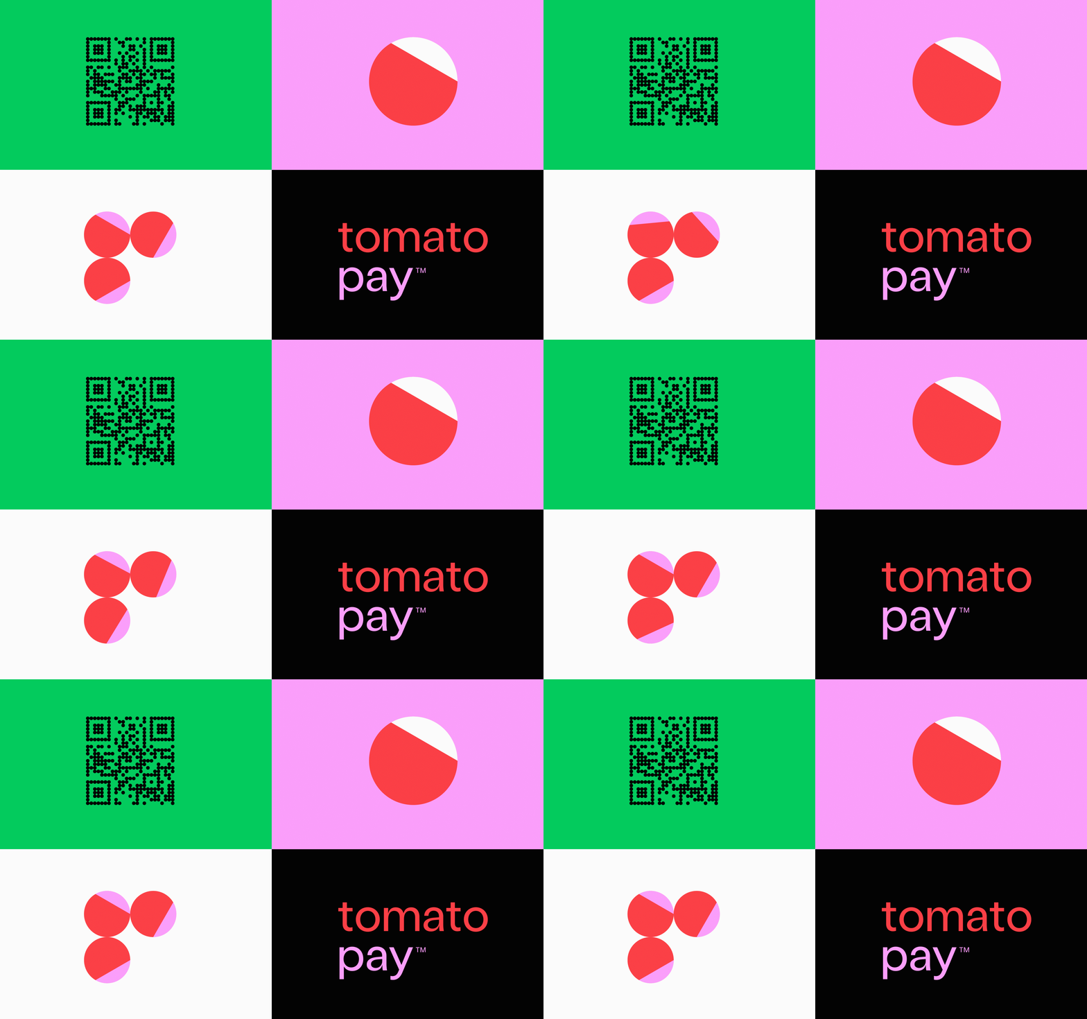
Fintech brand identity split into four quadrants: QR code, animated circle logo, and wordmark with neon color system.
Summary
Fintech brand identity split into four quadrants: QR code, animated circle logo, and wordmark with neon color system.
Visual description
Four-quadrant layout on a grid: top-left shows a black QR code on bright kelly green. Top-right displays a red circle with a white wedge on hot magenta pink. Bottom-left has three animated red circles with alternating pink wedges on off-white. Bottom-right sets coral-red lowercase "tomato" and lighter magenta "pay™" (with trademark mark) on pure black. Clean geometric sans-serif throughout.
Key takeaway
Fintech color system (neon green, hot pink, coral) that stands out in crowded app marketplaces. The four-quadrant structure efficiently showcases identity elements (mark, animated form, wordmark, trademark combo) in one cohesive lockup.
Reuse notes
Strong fit for digital-wallet, payment-app, or fintech-platform branding. Works at small scale (app icon) and large scale (splash screens). The high contrast between segments ensures legibility on any background.
More like this



Keep what you find
A free account saves references to boards and can send you a weekly email of picks based on what you save.
To see every result, go Pro.