Preview image. Unlock full-res
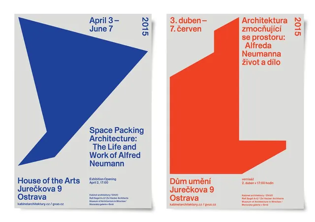
Two paired exhibition posters for an architecture museum show, each featuring a single bold geometric shape occupying two-thirds of the composition.
Summary
Two paired exhibition posters for an architecture museum show, each featuring a single bold geometric shape occupying two-thirds of the composition in a contrasting color.
Visual description
The left poster presents a large cobalt-blue chevron or arrow shape pointing right, leaving a light-gray background with small-caps date and year text ("April 3 - June 7 / 2015") in the upper corner. Below, a sans-serif title in the same cobalt reads "Space Packing Architecture: The Life and Work of Alfred Neumann" with venue details ("House of the Arts Jureczkova 9 Ostrava") anchored at the bottom in dark blue. The right poster mirrors the layout with a bright red-orange geometric shape (an angular, stacked form suggesting architectural massing) and the same structured typography in red, announcing an alternate exhibition date and title in Czech. Both posters use a thin black line to divide the shape from the text area, and the overall composition relies on pure geometric forms, high contrast, and strict typographic hierarchy with minimal decoration.
Key takeaway
The discipline of a single shape carrying 70 percent of visual weight, leaving plenty of white space for hierarchical text. The complementary color pairing (blue and red-orange on neutral) creates instant visual distinction between paired items while maintaining cohesion through identical grid structure. The use of a dividing line to separate image from information zones is a clean, reusable compositional move.
Reuse notes
Strong for museum, cultural institution, or architecture practice marketing. Works well when you need to promote two related events, exhibitions, or offerings side by side with instant visual differentiation. The layout assumes clean sans-serif in multiple weights; scale it for signage or reduce to digital social contexts.
More like this

Keep what you find
A free account saves references to boards and can send you a weekly email of picks based on what you save.
To see every result, go Pro.