Preview image. Unlock full-res
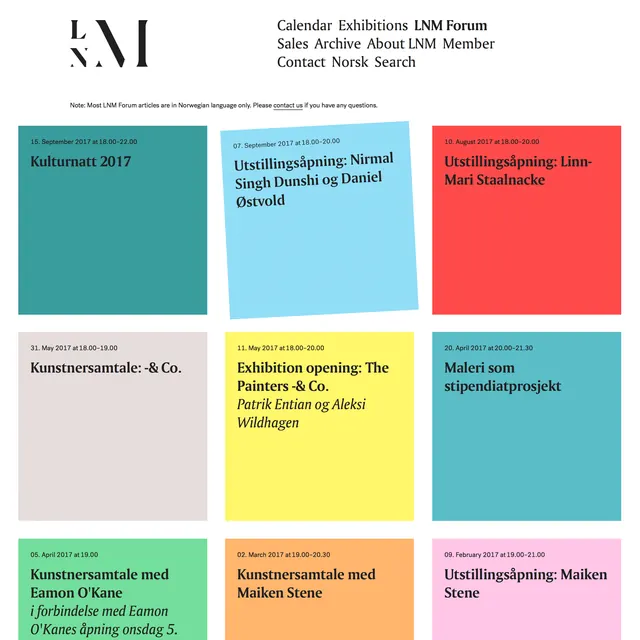
A calendar events listing using a 3-by-3 grid of colored rectangular tiles, each with dates and event titles in bold sans-serif, typical of Nordic art-gallery event schedules.
Summary
A cultural calendar layout displaying nine upcoming art exhibitions and events in a 3-by-3 grid, each event in a solid color block with the date and title in dark sans-serif type.
Visual description
Nine event tiles arranged in a regular grid. Each tile is a solid background color (teal, light blue, coral, yellow, pale pink, lime-green, orange, pink, and teal) with a small date label in a light color at the top left and the event title(s) in bold, dark sans-serif below. One tile includes italicized artist names as secondary text. No borders or drop shadows; flat color fields only. The tiles have crisp right angles and sit tightly against one another. A header with the institution name (LNM Forum), primary navigation links, and a search prompt anchors the top of the page.
Key takeaway
The use of bold, unmodulated color blocks as structural units that also carry semantic weight (each event gets its own color). The hierarchy of small label text and large title text within each tile. The systematic grid that makes scanning many items quick and unambiguous.
Reuse notes
Perfect for event listings, exhibition schedules, and cultural calendars where color-coding by event type or date-range aids usability. The flat aesthetic reads as contemporary and playful rather than corporate, well-suited for arts, galleries, museums, and nonprofits. Legibility benefits from good contrast between text color and background color.
More like this






Keep what you find
A free account saves references to boards and can send you a weekly email of picks based on what you save.
To see every result, go Pro.