Preview image. Unlock full-res
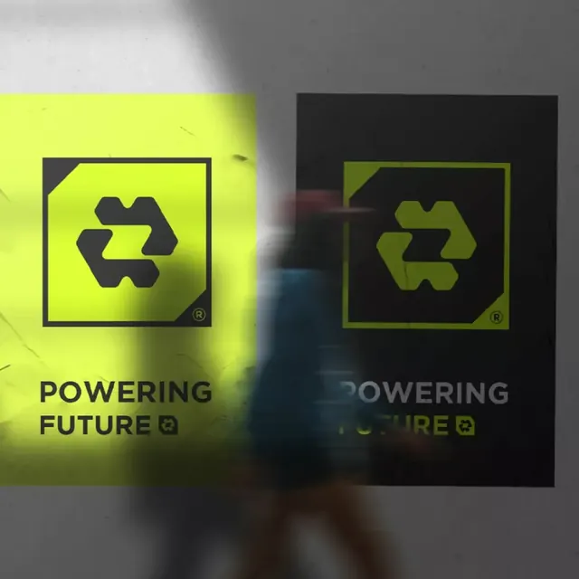
Symmetrical dual-panel logo showcase in lime and black, each showing an arrow recycling mark with corner accents, emphasizing sustainability and forward momentum.
Summary
Symmetrical dual-panel logo showcase in lime and black, each showing an arrow recycling mark with corner accents, emphasizing sustainability and forward momentum.
Visual description
Two square panels positioned side by side, left in bright lime yellow on a light background, right in deep black on a dark gray background. Each panel contains an identical arrow-based recycling symbol in the opposite color, rendered as thick, geometric strokes forming a triangular circulation mark. A small corner accent (a triangular notch) appears in the upper left of each square frame, creating visual consistency. Bold, all-caps sans-serif text reading "POWERING FUTURE" sits beneath each panel. A subtle motion blur in the foreground adds depth and dynamism, suggesting movement and forward progress. The registered trademark symbol appears in the lower right of each mark.
Key takeaway
The dual-palette presentation shows the mark's versatility across light and dark backgrounds simultaneously, reducing the need for separate mockups. The corner accent adds a distinctive, recognizable detail to an otherwise simple geometric form. The motion blur in the foreground is a subtle technique that conveys energy without overwhelming the brand mark itself.
Reuse notes
Excellent for environmental, sustainability, or green-tech brands wanting to assert forward momentum and responsibility. The dual-panel format works well in brand guidelines, pitch decks, or website hero sections where you need to demonstrate versatility. The color contrast is strong enough for signage and small sizes. Best paired with environmental, energy, or technology messaging.
More like this






Keep what you find
A free account saves references to boards and can send you a weekly email of picks based on what you save.
To see every result, go Pro.