Preview image. Unlock full-res
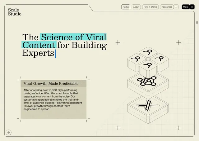
A website hero section showcasing content methodology through layered 3D isometric cube illustrations, warm neutral tones, and highlighted cyan accent text on core headline phrases.
Summary
A website hero section for Scale Studio presenting content-strategy methodology via a split layout: a left text block explaining viral growth principles, and a right side showcasing nested 3D isometric cube illustrations with small icons representing interconnected expertise layers.
Visual description
A cream-colored background with the site header "Scale Studio" and navigation (Home, About, How It Works, Resources, More) in the top-left. The main headline mixes serif and sans-serif: "The Science of Viral Content for Building Experts," with the word "Viral" highlighted in a bright cyan box. Below left is a beige-gray text block titled "Viral Growth, Made Predictable" containing body copy explaining the content formula, enclosed in a subtle border. To the right is an exploded isometric view of stacked transparent cubes, each bearing a small abstract icon (arrows, network nodes, zigzags) representing different content layers and strategic elements. The cubes are arranged in a pyramidal 3D stack suggesting depth and interconnection. Plus signs (+) and crosshair icons are scattered as subtle design elements. The overall palette is warm neutrals with a single cyan accent, creating a trustworthy yet contemporary aesthetic.
Key takeaway
The 3D isometric blocks convey layered complexity and interconnection without becoming cluttered or overly technical. The cyan highlight on key words breaks the monochrome palette and directs the reader's eye to core concepts. The split text-and-graphic composition balances explanation with visual proof of structured thinking, suitable for expertise-positioning messaging.
Reuse notes
Ideal for consulting, marketing agency, or content-strategy positioning pages. The isometric cube pattern works well for illustrating methodology, tech stacks, process steps, or layered frameworks. The warm, muted palette and clean typography suit professional B2B contexts. The single bright accent (cyan) can be adapted to any brand color and remains effective in drawing attention to critical value props.
More like this






Keep what you find
A free account saves references to boards and can send you a weekly email of picks based on what you save.
To see every result, go Pro.