Preview image. Unlock full-res
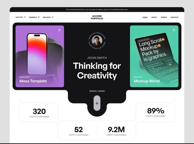
A centered design portfolio landing page with a split-card layout showcasing two project examples flanking a hero headline, complemented by customer metrics below.
Summary
A centered design portfolio hero with two rounded-corner project cards in complementary bright colors flanking a large central headline, grounded by visible customer metrics at the bottom.
Visual description
The page opens with an announcement bar in black. Below, a light navigation with social links (Twitter, Dribbble, Behance) on the left and a centered logo reading "ACCORD PORTFOLIO" with nav items (Home, About, Works, Contact) right-aligned. The hero section features a dark background with two large cards side by side: a magenta card on the left displaying a mobile app mockup with a gradient screen and labeled "Mobile App: Moxa Template"; a teal card on the right showing a stylized device displaying a design tool interface labeled "Branding: Mockup World". Between the cards sits a centered headline "Thinking for Creativity" in large white sans-serif, with a circular avatar portrait of "John Smith" and descriptive text above. Below both cards sit four customer metrics in light boxes: "320 Happy Customer" (left), "89% Happy Customer" (top right), "52 Happy Customer" (bottom center), and "9.2M Happy Customer" (right). A "Scroll Down" indicator sits between the cards pointing downward.
Key takeaway
The two-card design pattern: flanking mockup cards in contrasting brand colors creates visual rhythm while showcasing different work types. Centering the headline and metrics beneath anchors the composition. Using real customer numbers (even templated ones) builds trust without additional copy.
Reuse notes
Strong template for design and creative portfolios. Works best when the two adjacent projects are visually distinct enough to benefit from color differentiation. The metric callouts below provide credibility scaffolding for agency or freelance pitches.
More like this


Keep what you find
A free account saves references to boards and can send you a weekly email of picks based on what you save.
To see every result, go Pro.