Preview image. Unlock full-res
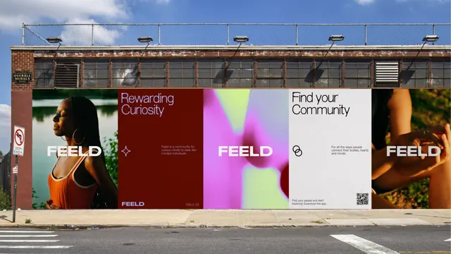
Street billboard split into four distinct panel sections, each pairing portraits with color fields and contrasting typography to communicate different community messages.
Summary
A four-panel street billboard for FEELD pairing full-bleed color blocks (magenta-to-chartreuse, maroon, white, amber) with cropped portraits and minimal sans-serif headings to signal different aspects of community building.
Visual description
The billboard spans roughly 40 feet horizontally and is divided into four equal vertical sections. Left panel: maroon background with a girl in orange top, "Rewarding Curiosity" in light sans-serif, FEELD logo and small body copy. Second panel: vibrant magenta-to-lime-green diagonal gradient with centered "FEELD" in white display type. Third panel: cream/off-white ground with "Find your Community" and a QR code. Right panel: warm amber-to-brown fade with a closeup portrait and FEELD lockup. The typography is clean, all-caps or sentence case; the color palette is intentionally high-contrast to read from distance.
Key takeaway
The modular four-part rhythm that separates distinct messages (curiosity, brand, action, belonging) while maintaining visual unity through consistent logo placement and typography. The color blocking (not merely background, but a dominant design move) paired with portrait crops creates depth without clutter. The QR code integration as a natural design element rather than an afterthought.
Reuse notes
Effective for nonprofit, social, or community campaigns where multiple messages must coexist on one canvas. The portrait-plus-color-field formula scales across panels. Works best when read from 20+ feet away; each panel holds a discrete idea, so messages can be mixed/reordered. Requires strong photography and bold color restraint.
More like this

Keep what you find
A free account saves references to boards and can send you a weekly email of picks based on what you save.
To see every result, go Pro.