Preview image. Unlock full-res
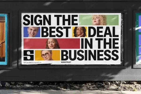
A commercial billboard design combining oversized sans-serif typography with a color-blocked grid of portrait photographs, using five primary colors to anchor each text and image section in a high-impact direct-mail layout.
Summary
A commercial billboard for SongTrust announcing a business offer using a bold sans-serif headline split across colored rectangles, interspersed with portrait photographs of diverse individuals in a modular grid that creates rhythm and personality.
Visual description
The billboard is mounted on a storefront window and divided into five horizontal-vertical sections. The headline reads "SIGN THE BEST DEAL IN THE BUSINESS" with each phrase in a different color block: "SIGN THE" over a light blue and white section containing a portrait, "BEST" positioned next to a yellow section with a portrait, "DEAL" spanning to a red-burgundy section, and "IN THE BUSINESS" completing the sequence. The bottom green bar shows "SONGTRUST" branding and the tagline "SONGTRUST" with "EST. 1891" in a logo. Five distinct portrait photographs (representing diverse ethnicities and ages) are arranged in the grid, each backed by its color zone, creating visual interest and humanizing the commercial message. The sans-serif typeface is heavy and geometric, all-caps, providing maximum legibility at distance. The overall effect is assertive and modern, with the color blocking guiding the eye across the composition.
Key takeaway
The use of color-blocked rectangles to section both text and imagery, making a dense message read in sequence rather than all at once. The pairing of large portrait photography with bold typography, which adds humanity and diversity to an otherwise corporate message. The modular grid system that allows the composition to flex horizontally while maintaining color and textural balance. The approach turns a direct sales message into something visually complex that rewards close viewing.
Reuse notes
Ideal for high-visibility advertising (billboards, transit, retail storefronts) where the message must be bold and memorable. The portrait grid is particularly effective for B2B or fintech brands that want to convey inclusivity and approachability alongside professional authority. The color blocking should be strong enough to read from distance; pastel or muted colors will reduce impact. Works well when paired with a sans-serif typeface that has enough weight to compete visually with photography. Best suited for horizontal billboard formats rather than vertical or square layouts.
More like this


Keep what you find
A free account saves references to boards and can send you a weekly email of picks based on what you save.
To see every result, go Pro.