Preview image. Unlock full-res
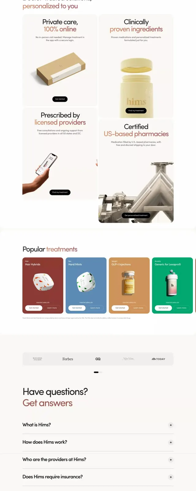
Telemedicine service landing page combining lifestyle photography, customer testimonials, and product imagery to build trust in direct-to-consumer healthcare.
Summary
A telemedicine landing page for a direct-to-consumer healthcare brand combining large lifestyle photography with service categories, treatment cards, and product bottles to establish credibility and guide users through care options.
Visual description
The page uses a light neutral background with black and warm earthy tones. The header displays a value proposition in serif and sans-serif type with navigation. Three large portrait photographs show diverse users, each labeled with treatment categories (Sex, Weight, Hair) and describing in-depth care. Below, two product-focused sections present prescription bottles and pharmaceutical manufacturing imagery with supporting copy. A four-card grid highlights treatment types, each with a muted color background (mauve, blue, tan, green). An expandable FAQ section sits above a dark footer containing contact information, social links, and brand messaging in a two-column layout.
Key takeaway
The testimonial card pattern (large photo plus minimal label plus brief descriptor) that turns customers into credibility signals. The two-product comparison layout with real manufacturing imagery to convey legitimacy. The restricted warm palette (tan, green, mauve) that humanizes pharmaceutical without feeling clinical.
Reuse notes
Strong for direct-to-consumer healthcare, wellness, or supplement brands. The lifestyle-first visual hierarchy works when you have authentic customer photography. Needs a clear product or service benefit hierarchy to avoid overwhelming; use the accordion FAQ pattern to surface common questions without scrolling. The warm earth tones work best on light backgrounds; pair with clean sans-serif body text for maximum clarity.
More like this


Keep what you find
A free account saves references to boards and can send you a weekly email of picks based on what you save.
To see every result, go Pro.