Preview image. Unlock full-res
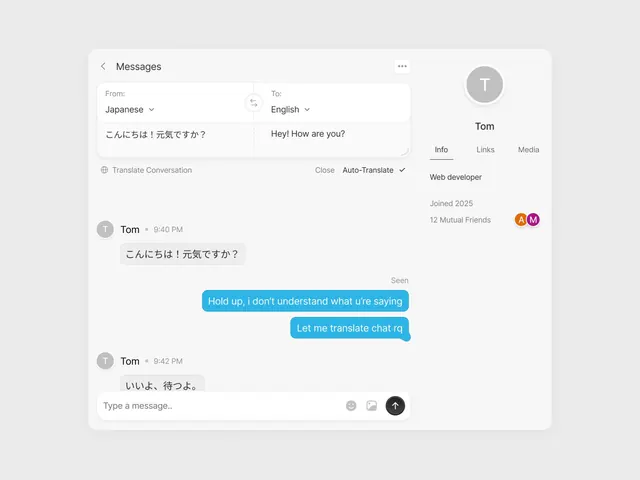
Messaging interface showing side-by-side Japanese and English conversation with a translating chat UI, teal accent buttons on a neutral light background.
Summary
Messaging interface showing side-by-side Japanese and English conversation with a translating chat UI, teal accent buttons on a neutral light background.
Visual description
Split-screen messaging layout: left side shows input fields for Japanese-to-English translation with a sample conversation, right side displays the user profile card for "Tom" (web developer, joined 2025). The conversation thread uses a common pattern: left-aligned gray message bubbles from Tom, right-aligned bright teal bubbles for the user. Timestamp at 9:42 PM appears in muted gray. A "Translate Conversation" button sits above the chat with language dropdowns at top. The input field at bottom has emoji, attachment, and send buttons. All type is clean sans-serif in dark gray or black. The background is near-white with subtle light-gray dividers.
Key takeaway
The calm, uncluttered dual-panel layout that pairs input/composition on the left with social context on the right. The teal accent color choice that pops subtly against neutral grays. The functional button arrangement (emoji, attachment, send) without visual clutter.
Reuse notes
Ideal reference for messaging, collaboration, or translation-feature UI. The translation-pairs layout pattern works well for any bilingual or side-by-side-comparison interface. The profile card placement anchors the conversation to a person rather than abstract text. Avoid using this pattern if the interface needs to emphasize user avatars in the thread itself.
More like this

Keep what you find
A free account saves references to boards and can send you a weekly email of picks based on what you save.
To see every result, go Pro.