Preview image. Unlock full-res
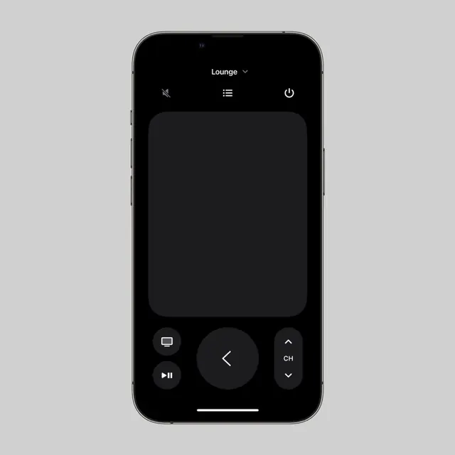
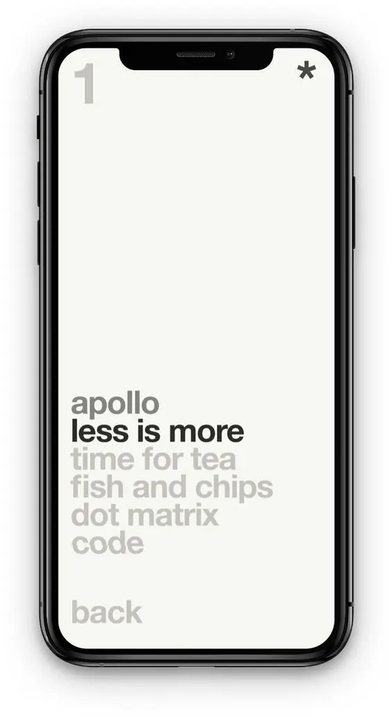
A mobile phone mockup with minimalist typography hierarchy showing an app concept named 'apollo' with a 'less is more' tagline, cream background, and progressive text disclosure.
Summary
A phone mockup showing a minimalist app interface using strict typographic hierarchy on a cream background with layered text of decreasing visual weight.
Visual description
Black-framed iPhone mockup displaying a cream-background app screen. Content is organized vertically with a numbered navigation element (1) in the top-left corner, and a symbol toggle (asterisk) in top-right. The hero text reads 'apollo' in gray caps, followed by bold black sans-serif reading 'less is more'. Below, secondary content lines in progressively lighter gray ('time for tea', 'fish and chips', 'dot matrix', 'code') establish a clear hierarchy. A 'back' button in light gray sits at the bottom. Every typographic element is precisely spaced, with the full screen demonstrating information architecture through weight and tone alone, no colored accents.
Key takeaway
Typographic hierarchy achieved through weight, size, and color tone rather than decorative elements. Three-tier grayscale system (black, mid-gray, light-gray) to organize content priority. Clean left-aligned text layout with generous vertical breathing room.
Reuse notes
Ideal for app UI references, content-first mobile interfaces, or digital products emphasizing readability over imagery. Pairs well with helvetica or DIN-inspired sans-serif families.