Preview image. Unlock full-res
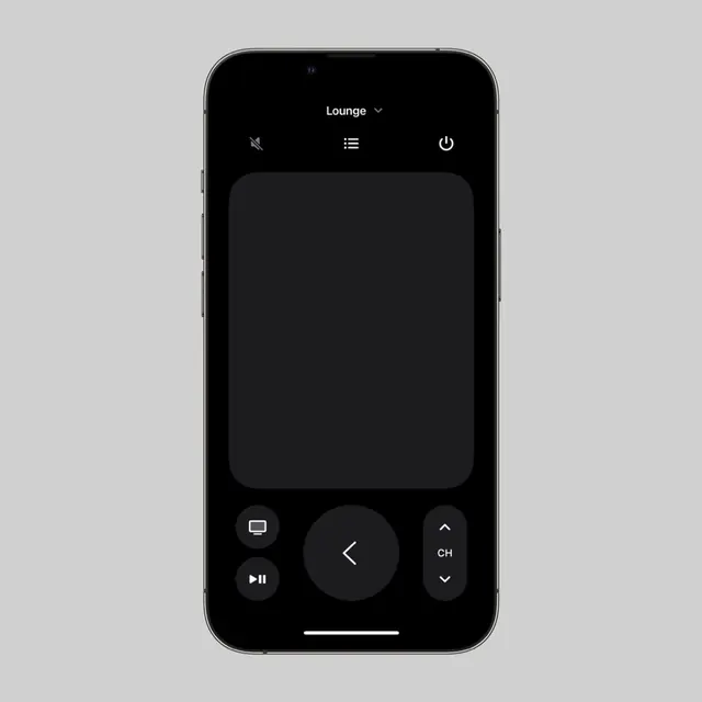
A minimalist dark-mode mobile UI mockup for a media remote control app featuring a monochromatic button layout with rounded rectangles and circular controls.
Summary
A minimalist dark-mode mobile UI mockup for a media remote control app featuring a monochromatic button layout with rounded rectangles and circular controls.
Visual description
An iPhone frame with a dark gray or charcoal background. At the top, a white "Lounge" dropdown label sits above three icon buttons (mute/unmute, menu lines, power). The main content area is a large rounded rectangle suggesting a display or output zone (darker still, recessed). Below, a control pad: a large central circular arrow button pointing left, flanked by two smaller rectangular buttons on each side (left shows a TV icon and media play buttons; right shows "CH" with up/down chevrons). At the very bottom, a thin white line represents the gesture bar. All buttons use dark gray fills with white outlines or inverted styling. Typography is sparse and minimal. No gradients or skeuomorphic details.
Key takeaway
The proportional hierarchy: a dominant circular control surrounded by smaller rectangular controls creates clear action priority without visual clutter. The minimal use of color contrast (white UI on dark gray) maintains visual calm while keeping edges legible. The grid structure (centered column) prevents interaction zones from competing for attention.
Reuse notes
Ideal for designing media players, IoT device controls, or any app requiring frequent, predictable button interactions. The dark palette reduces eye strain for late-night usage. The flat, geometric approach keeps load times fast on older devices. Works well for tablets and large phones; very small screens might need larger touch targets.
More like this




Keep what you find
A free account saves references to boards and can send you a weekly email of picks based on what you save.
To see every result, go Pro.