
Preview image. Unlock full-res
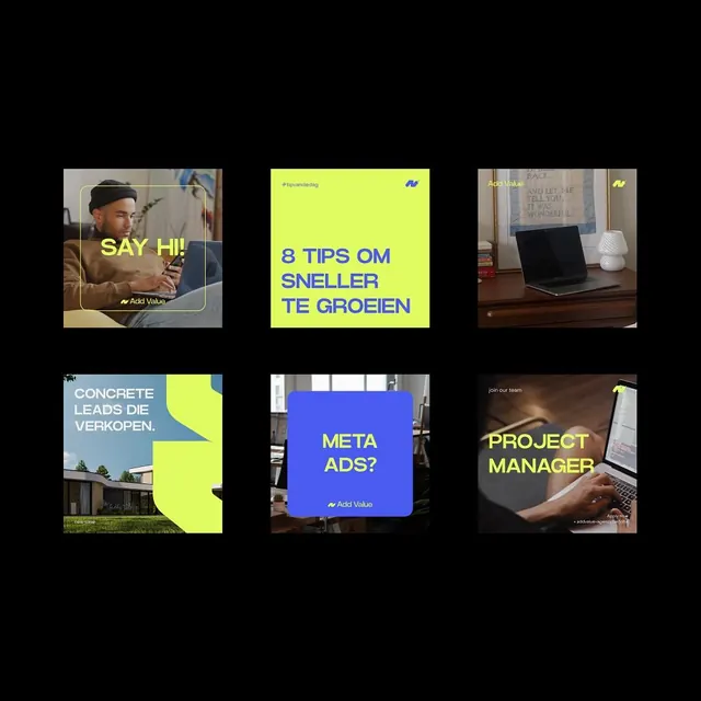
A 3x2 grid of promotional cards for Add Value, alternating neon-blue fields with lime-yellow panels, using stark color contrast and clean sans-serif type over photographic and solid backgrounds.
Summary
A 3x2 grid of promotional cards for Add Value, alternating neon-blue fields with lime-yellow panels, using stark color contrast and clean sans-serif type over photographic and solid backgrounds.
Visual description
Six promotional cards arranged in a 3x2 grid on black. Top row: left card is blue with yellow sans-serif headline "BEKIJK ONZE NIEUWSTE CASE HIER" and downward arrow (outdoor backdrop); center card is dark with overhead shot of hands typing, yellow subtext "Growth marketing agency met focus op winst"; right card is bright lime-yellow with blue text "8 TIPS OM SNELLER TE GROEIEN" and small blue logo (hashtag icon). Bottom row: left card is dark with rounded corners, hands/laptop photo, yellow text repeating the growth marketing copy, bordered frame; center card is blue and lime-yellow split diagonally with large headline "PROJECT MANAGER?" in yellow, small body text; right card is warm-toned interior scene with laptop on desk, small "Add Value" logo. All cards maintain the same color vocabulary and small "Add Value" branding.
Key takeaway
The extreme color contrast (neon-blue and electric-lime on black) cuts through clutter. The consistent sans-serif display typeface in yellow/white creates a unified visual system across varied compositions. Mixing full-bleed photography with solid color fields keeps layouts dynamic and type-readable.
Reuse notes
Effective for B2B marketing, consulting, or growth-focused tech agencies. The neon palette demands restraint on text color (stick to yellow or white) to stay legible. Works as an email campaign, social carousel, or small-format collateral set. The grid format reinforces brand consistency without repetition.
More like this




Keep what you find
A free account saves references to boards and can send you a weekly email of picks based on what you save.
To see every result, go Pro.