Preview image. Unlock full-res
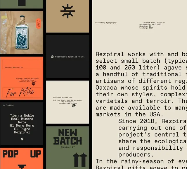
A modular brand collage for a craft spirits producer featuring square and rectangular panels showcasing product photography, color blocking, monospaced body copy, and symbol mark against an earthy palette.
Summary
A brand identity system for Rezpiral mezcal organized as a grid of square and rectangular modules, combining product photography, geometric symbol marks, earthy color fields, and monospaced typography describing producer history and philosophy.
Visual description
A modular grid layout composed of distinct square and rectangular panels in varied proportions. Top left shows a tall square with product photography (a mezcal bottle with wax seal against kraft paper background). Below is a burnt-orange rectangle with the brand text "Rezpiral Spirits & Co." in a delicate serif. A tan square displays a geometric asterisk-like symbol mark in dark olive. A black rectangle contains "Succulent Spirits & Co." in white sans-serif and the symbol. A tan-orange square reads "for Mike" in a flowing script. A dark rectangle displays producer names (Tierra Noble, Neta, etc.) in white sans-serif. A bright orange square announces "POP UP" in monospaced caps. The right side features a moss-green rectangle with "NEW BATCH" in dark sans-serif and the symbol mark. Body copy in monospaced typewriter font describing the producer and products occupies the far right. The entire palette is earthy: cream, warm terracotta, dark olive green, black, and muted tones.
Key takeaway
The modular grid system allows complex brand information to remain scannable and playful rather than overwhelming; mixing photography, solid color fields, and typography creates visual interest without decoration; the monospaced typeface lends authenticity and craft sensibility appropriate to artisanal spirits; the geometric symbol mark (asterisk-like) is simple enough to scale and distinctive enough to anchor the identity across scales.
Reuse notes
Ideal for craft food and beverage brands, particularly those with a story-driven or artisanal positioning. The modular approach works for both packaging collateral and print materials. The earthy color palette and serif/sans/monospace mix convey premium authenticity without pretension. Works especially well when the producer has multiple voices to communicate (producers, regions, product stories).
More like this

Keep what you find
A free account saves references to boards and can send you a weekly email of picks based on what you save.
To see every result, go Pro.