Preview image. Unlock full-res
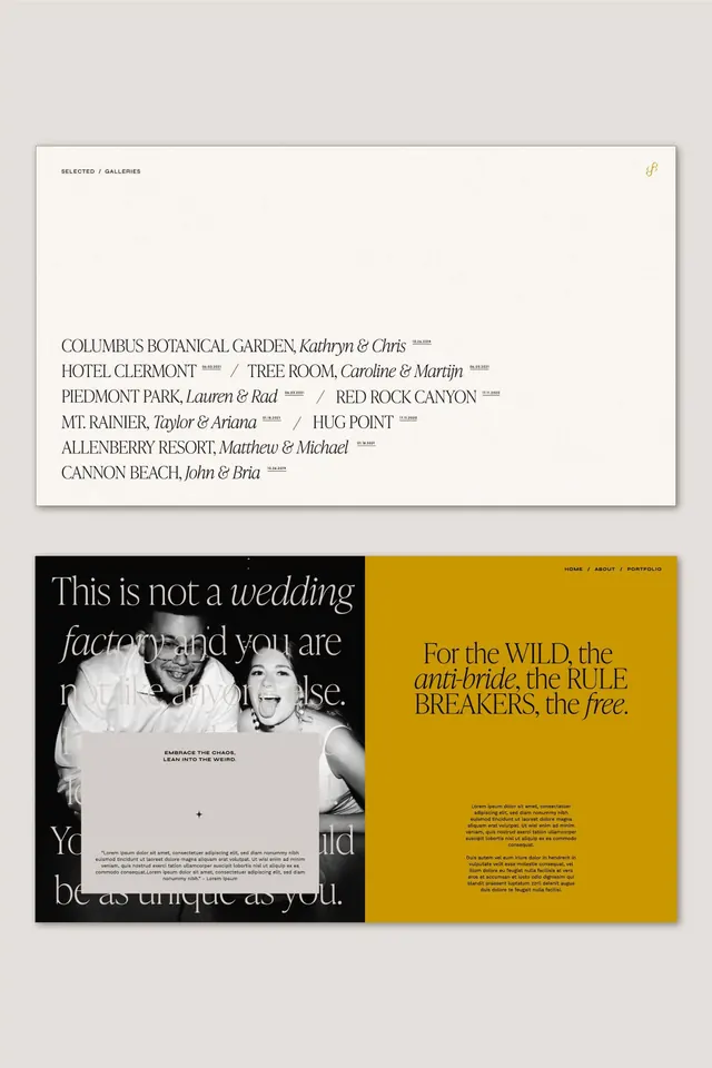
Multi-page wedding editorial with curated location roster and two-panel spread featuring serif-italic prose over black-and-yellow color-blocked sections.
Summary
Multi-page wedding editorial brochure combining a venue roster with a split-panel spread pairing black and warm ochre backgrounds.
Visual description
The brochure opens with a cream-toned title page listing venues in serif italic: "COLUMBUS BOTANICAL GARDEN," "HOTEL CLERMONT," "PIEDMONT PARK," and others, each with location and designer attribution in small caps. The main spread splits into two distinct panels. The left side displays a black background with white serif-italic prose ("This is not a wedding factory, and you are not a bride") layered over a black-and-white couple photograph. The right side saturates the space with warm ochre yellow, holding bold serif headlines ("For the WILD, the anti-bride, the RULE BREAKERS, the free") in dark serif with body text below in a light gray serif. The palette throughout ties to creams, blacks, and this single warm yellow-ochre, creating stark contrast.
Key takeaway
Pairing of serif italic prose with serif display headlines for editorial credibility. The color-block split (black and ochre) creates visual drama without using many colors. Location rosters in small-cap serif feel premium and organized.
Reuse notes
Strong for wedding, event, or editorial branding. The serif-italic treatment reads sophisticated and works with a simple two-color palette. Works best when subject matter (venue, brand, narrative) justifies the premium treatment.
More like this



Keep what you find
A free account saves references to boards and can send you a weekly email of picks based on what you save.
To see every result, go Pro.