Preview image. Unlock full-res
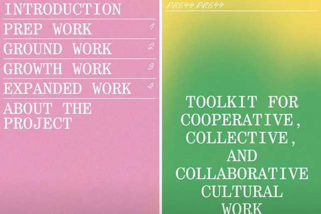
A vertical navigation menu split into two color zones: pink/mauve left column with text labels, yellow-to-green gradient right panel with a centered title.
Summary
A two-part navigation layout split vertically: pink-mauve left sidebar listing six items (Introduction, Prep Work, Ground Work, Growth Work, Expanded Work, About the Project) each numbered with a small superscript, and a yellow-to-green gradient right column centered on large display type announcing a toolkit for collaborative cultural work.
Visual description
Left panel: solid pink background with six left-aligned labels in white uppercase sans-serif, each flanked by a hairline horizontal divider and a small superscript number (1-4 visible). Text is evenly spaced top to bottom, creating a vertical navigation structure. Right panel: a vibrant linear gradient shifting from mustard yellow at top through lime green to emerald at bottom, with large centered white sans-serif display text spanning three lines. A small italicized label "PREP PREP" appears in yellow at the very top right corner. The overall split is exact vertical bisection.
Key takeaway
The color-blocking discipline using a monochromatic sidebar as a neutral navigation anchor against a bold, warm gradient; the numbered list treatment with micro-typography (superscript figures) for visual rhythm; the centered display type on a gradient background that remains readable through high contrast.
Reuse notes
Strong for educational materials, curriculum guides, or workshop documentation where a sidebar index pairs with a gradient-highlighted main panel. Works well when the sidebar supplies navigation context and the right side spotlights the featured section. Gradient direction (warm into cool) reads as forward momentum.
More like this





Keep what you find
A free account saves references to boards and can send you a weekly email of picks based on what you save.
To see every result, go Pro.