Preview image. Unlock full-res
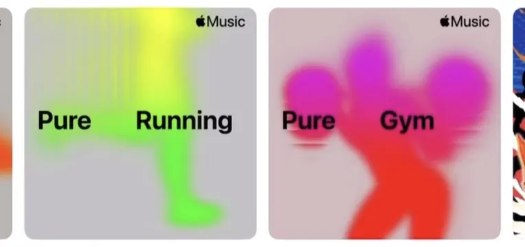
Apple Music playlist cards using soft blurred gradients and organic blob shapes to visually represent music genres and moods.
Summary
Apple Music playlist cards displaying genre names (Running, Gym) layered over soft, blurred gradient shapes that evoke movement and mood through color.
Visual description
A pair of light-background cards, each featuring a genre label and a large blurred gradient shape beneath it. The left card pairs lime green and yellow hues with "Pure Running"; the right combines magenta, coral, and red tones with "Pure Gym". Soft-focus blur creates the illusion of flowing, organic forms that suggest motion or energy within each tile. The rounded-corner card format is typical of iOS app UI. The Apple Music logo appears at the top of both cards.
Key takeaway
The technique of using abstract, defocused gradients as visual metaphors for intangible concepts (moods, music genres). The color palette deliberately invokes the emotional arc of each playlist category rather than literal imagery. Simple, readable type sits boldly on top of soft visual noise.
Reuse notes
Effective for app design, music or audio platforms, and mood-based categorization UI. Works best when the gradient color is warm and the blur radius is high enough to make the form abstract. Can feel generic if reused without intentional color choice per category.
More like this




Keep what you find
A free account saves references to boards and can send you a weekly email of picks based on what you save.
To see every result, go Pro.