Preview image. Unlock full-res
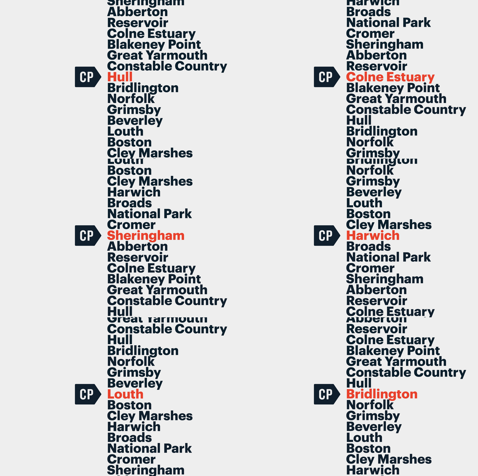
A stark wayfinding poster listing UK place names in heavyweight sans-serif with one entry highlighted in red, set against pale gray.
Summary
A stark wayfinding poster listing UK place names in heavyweight sans-serif with one entry highlighted in red, set against pale gray.
Visual description
Vertical list of UK geographical locations (Sheringham, Abberton, Reservoir, Colne Estuary, Blakeney Point, Great Yarmouth, Constable Country, Hull, Bridlington, Norfolk, Grimsby, Beverley, Louth, Boston, Cley Marshes) typeset in an extra-bold sans-serif, aligned to the right side of a light gray background. One entry, "Hull", is rendered in bright red while all others remain dark navy. A small dark navy hexagonal badge with white "CP" initials is positioned to the left of Hull, drawing the eye to that entry as a focal point. The type sits as justified right-aligned blocks with consistent line-height and generous spacing between entries.
Key takeaway
The use of a single color break in an otherwise monochromatic list to create instant hierarchy and guide attention without decoration or icons. The proportional boldness of the typeface and its weight handling against empty space. The clean badge-plus-text pairing as a minimal indicator system.
Reuse notes
Strong for public information, transit, or regional directory design. The scale and rightward-flush treatment works well on signage or printed materials. Avoid breaking the list flow with additional elements beyond a single accent color.
More like this

Keep what you find
A free account saves references to boards and can send you a weekly email of picks based on what you save.
To see every result, go Pro.