Preview image. Unlock full-res
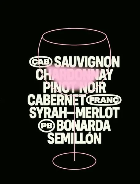
Wine-label typography specimen with a minimalist outlined glass frame and white-and-pink text listing varietals and regions on black.
Summary
Minimalist wine-label type specimen with a thin outlined wine-glass illustration framing bold display text listing grape varietals and regions in white and pale pink on black.
Visual description
Black background fills the full frame. A delicate single-line wine-glass outline sits centered, drawn in pale cream/white strokes. Inside and around the glass sits a hierarchy of white sans-serif text in varying weights, listing "CAB SAUVIGNON", "CHARDONNAY", "PINOT NOIR", "CABERNET FRANC", "SYRAH MERLOT", "BONARDA", and "SEMILLON" in all-caps display type. Accents and parenthetical abbreviations are interspersed (e.g., "FRANC" in parentheses). A pale pink horizontal band or wash sits near the top-middle of the glass, adding a subtle warm accent without disrupting the monochromatic scheme. The bottom of the glass tapers to a stem and base, maintaining the technical outline style.
Key takeaway
The outlined glass is a single-element frame that orients the type vertically without needing a box or background change. Introducing pink as a single-color accent against black and white is restrained but memorable. The tightly stacked varietal list reads as legible and authoritative, not cramped.
Reuse notes
Ideal reference for luxury beverage, wine, or craft-spirits packaging. The minimalist approach works for high-end brands that prize sophistication over decoration. The outlined-illustration approach is economical (easy to print, scale, or adapt) yet distinctive. The type-heavy composition suits label applications where legibility of ingredients or details is essential but design impact is equally important.
More like this



Keep what you find
A free account saves references to boards and can send you a weekly email of picks based on what you save.
To see every result, go Pro.