Preview image. Unlock full-res
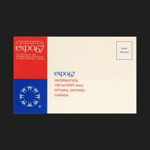
A mid-century institutional postal card for Expo 67 using bold red and blue color blocks with geometric symmetry and a starburst emblem.
Summary
A postal card for the 1967 Montreal Exposition using bold red and blue color blocking with a white geometric starburst emblem and clean sans-serif typography.
Visual description
A cream-colored postcard divided into distinct functional zones. The upper left quarter contains a red block with white text announcing the exhibition dates and location; directly below is a blue block featuring a white starburst or radial flower emblem (Expo 67's symbol), centered and symmetrical. The remaining cream space holds the title "expo67" in blue sans-serif capitals followed by "INFORMATION," and below that an address in red and black sans-serif. A small "POSTAGE" box with blue border sits in the upper right corner. The composition relies on pure geometric division and high-contrast color to organize information clearly.
Key takeaway
The clarity of color-blocked zones to separate information types; the pairing of institutional sans-serif with a distinctive symbolic emblem; the way a cream ground allows both saturated and neutral elements to coexist without competition.
Reuse notes
Strong reference for institutional postcards, event promotion, and information-heavy layouts where hierarchy must be immediate and colors do the organizational work. Works well for museum, expo, or governmental contexts. The starburst gives personality without sacrificing legibility or formality.