Preview image. Unlock full-res
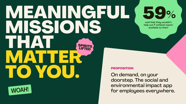
Mission-statement graphic with white and yellow all-caps type anchoring a deep-green-and-pink split composition, leading with social-impact messaging.
Summary
Mission-statement graphic pairing oversized yellow and white type ("Meaningful Missions That Matter To You") on forest green, with a bright pink accent panel introducing the value prop in smaller text, anchored by lime-green callout badges.
Visual description
Left side dominates with a teal-to-dark-green background holding stacked white and oversize golden-yellow sans-serif type in all caps. A pink speech bubble ("Spirits Lifted") floats in the middle, while a rounded lime-green shape (top right) contains a 59% stat in white text. Lower left shows a green "Woah!" badge. Right side shifts to cream-white background with a magenta "PROPOSITION" label and smaller serif body copy describing the app's impact. The composition is asymmetric, using color blocking and label hierarchy to guide the eye from headline through proposition.
Key takeaway
The split-panel layout dividing mission statement from functional benefit. The oversized all-caps headline treatment plus supporting type hierarchy. The strategic use of three accent colors (pink, lime, deep green) to unify contrast without clutter.
Reuse notes
Strong for mission-driven app onboarding or positioning decks. The split composition works well for paired concepts (problem/solution, why/how). Needs genuine impact claim, not placeholder copy.
More like this





Keep what you find
A free account saves references to boards and can send you a weekly email of picks based on what you save.
To see every result, go Pro.