Preview image. Unlock full-res
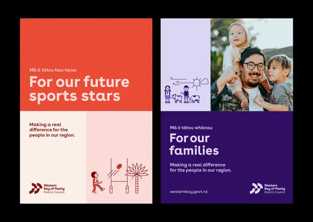
Dual-panel public-sector campaign using color-blocking and line illustration to separate youth sports and family support messaging with shared visual language.
Summary
A government campaign split visually into two distinct narratives using complementary colors and illustrative imagery to address youth sports investment and family support simultaneously.
Visual description
Two-panel composition on black background. Left panel (sports): coral-orange field with white headline "Ma a tatou hau-tipua / For our future sports stars" in bold sans-serif. Below: cream-colored sub-panel with dark-burgundy body text "Making a real difference for the people in our region" and a line-art illustration of a child climbing a stylized palm tree with geometric sun above. Western Bay of Plenty logo in dark red bottom-left. Right panel (family): deep indigo field with light-purple accent strip containing simple line-art of two adults and two children with sun and horizon sketch. White sans-serif headline "Ma o tatou whanau / For our families" with English subtext "Making a real difference for the people in our region." Website URL (westernbay.govt.nz) and white logo bottom-right. Bilingual Te Reo Maori and English throughout.
Key takeaway
The clarity of the split: one color per campaign message, complementary pairs (warm vs. cool) that are not aggressive. Both panels share the same typography scale, logo treatment, and tagline structure, making them feel like one cohesive effort despite the visual separation. The line-art illustration style is confident and economical: a few well-placed lines create narrative (family togetherness, growth) without realism or decoration.
Reuse notes
Strong model for public-sector or nonprofit campaigns addressing multiple constituencies in one push. The color split allows each audience to feel seen without creating visual chaos. Bilingual treatment shown here (Te Reo/English) is culturally essential for New Zealand; adapt the pattern as needed for other regions. Line art scales well across digital and print applications.
More like this




Keep what you find
A free account saves references to boards and can send you a weekly email of picks based on what you save.
To see every result, go Pro.