Preview image. Unlock full-res
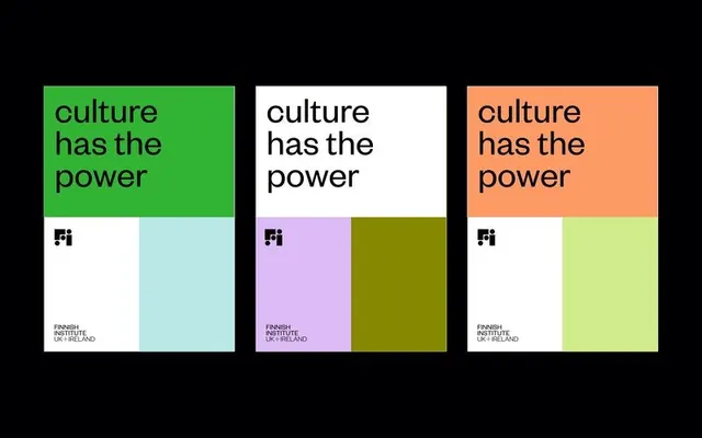
Institutional identity system using three color-blocked grid modules, each pairing a bold headline panel with complementary color swatches and small Fi logo.
Summary
Institutional identity using three identical grid modules, each containing a solid-color headline block with "culture has the power" text, plus two complementary color swatches and a small Fi mark logo below.
Visual description
Three rectangular modules displayed left to right on black. Each module is divided into a header section (lime green, white, or coral-orange) with "culture has the power" in black sans-serif, and a lower grid section with two color blocks: one white or light, one a complementary accent (pale blue, purple-pink, or lime-yellow). The Finnish Institute (Fi) mark appears in black bold type in the lower left of each color grid. The entire composition uses flat, hard-edged color blocking with no gradients or shadows. Set against a black void, the modules feel architectural and organized.
Key takeaway
The repeating grid module system that allows the same core message and identity to scale across multiple color directions. The stark black background that makes the color pops read even louder. The combination of a large type-forward block with a smaller color-swatch grid beneath, treating color as a structural element rather than a texture.
Reuse notes
Strong for educational or nonprofit institutional work. Works as a poster or campaign system where you want to show color flexibility. The high contrast and bold sans-serif feel authoritative and modern. The black backdrop is essential to make colors sing; may feel heavy in page layouts without careful spacing around it.
More like this

Keep what you find
A free account saves references to boards and can send you a weekly email of picks based on what you save.
To see every result, go Pro.