Preview image. Unlock full-res
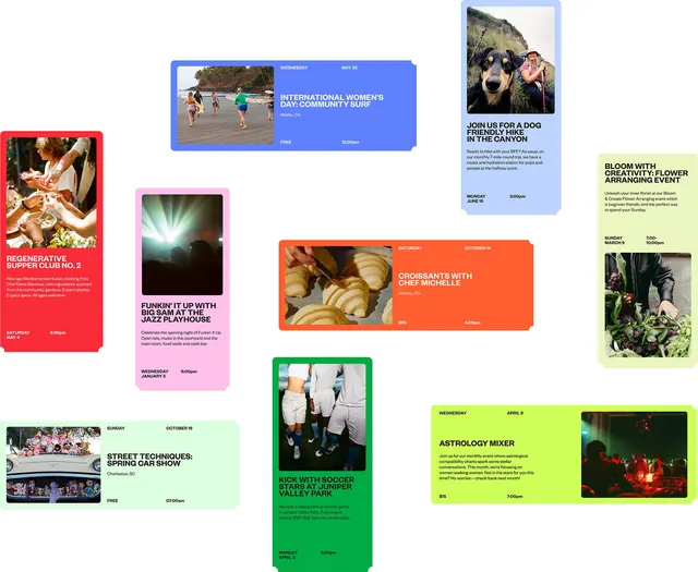
A set of community event posters layered across a page using saturated color-block backgrounds and documentary photography to announce fitness, cooking, and outdoor activities.
Summary
A set of community event posters layered across a page using saturated color-block backgrounds and documentary photography to announce fitness, cooking, and outdoor activities.
Visual description
Nine event announcement cards arranged in an overlapping, diagonal grid across a white background. Each card features a saturated accent color (lime green, coral, bright blue, pink, red, orange) paired with either a full-bleed documentary photograph or a geometric symbol in black. Lime-green and coral cards dominate the layout visually. Small sans-serif type in uppercase delivers event names (e.g. "INTERNATIONAL WOMEN'S DAY: COMMUNITY SURF," "FUNKIN' IT UP WITH BIG SAM AT THE JAZZ PLAYHOUSE," "KICK WITH SOCCER STARS AT JUNIPER VALLEY PARK"), with minimal supporting text. Time, date, cost (FREE or a dollar amount), and location appear in a consistent position on each card. Typography is legible and bold, slightly rotated on some cards for dynamic rhythm.
Key takeaway
The fearless use of saturated, contrasting background colors as content containers (not just aesthetics). The strategy of pairing photography with geometric symbol cards to break monotony. The confident diagonal stagger and overlap create visual depth without a complex grid system.
Reuse notes
Works for promotional community events, nonprofit fundraisers, or any campaign targeting active audiences. The documentary photography makes it feel local and authentic. If content density is light (as here), the layout breathes well; heavier text counts will need tighter spacing.
More like this


Keep what you find
A free account saves references to boards and can send you a weekly email of picks based on what you save.
To see every result, go Pro.