Preview image. Unlock full-res
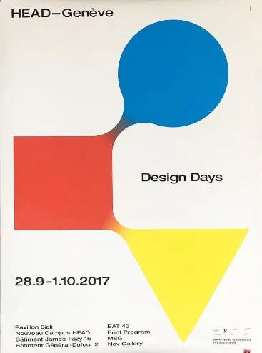
Event poster for HEAD Geneva using three bold geometric shapes (circle, square, triangle) in primary and accent colors with overlapping composition to announce Design Days 2017.
Summary
A poster for HEAD Geneva's Design Days 2017 that stacks three bold geometric shapes (bright blue circle, coral-red square, yellow triangle) in overlapping composition with sharp event details and venue information.
Visual description
The poster is built on three interlocking primary-color geometric forms: a bright royal blue circle (upper right), a warm coral-red square (left-center), and a bright yellow downward-pointing triangle (lower right). These shapes overlap and anchor the composition against an off-white background. In the top left corner, "HEAD–Geneve" sits in a minimal sans-serif. Event text is placed in negative space between and around the shapes: "Design Days" in black sans-serif sits center-right, with the date "28.9-1.10.2017" and venue details in smaller type below the red square. A thin horizontal line separates content zones. The bottom right contains small institutional logos and sponsor marks.
Key takeaway
The overlapping geometric-shape approach creates visual tension and depth without complex layering. Three primary hues on neutral ground read as confident and energetic. Negative space between shapes becomes strategic real estate for typography, forcing clarity over decoration.
Reuse notes
Works well for design-focused events, conferences, and academic institutions. The palette and shape grammar scale to other genres (product launches, gallery openings, arts nonprofits) by swapping colors. The overlapping technique can unify disparate content blocks on a layout while maintaining strict geometric structure.
More like this

Keep what you find
A free account saves references to boards and can send you a weekly email of picks based on what you save.
To see every result, go Pro.