Preview image. Unlock full-res
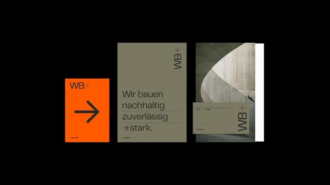
Three-panel corporate branding suite combining bold orange geometric shapes, muted olive-green cards with sans-serif type, and architectural photography against black.
Summary
Three-panel corporate branding suite combining bold orange geometric shapes, muted olive-green cards with sans-serif type, and architectural photography against black.
Visual description
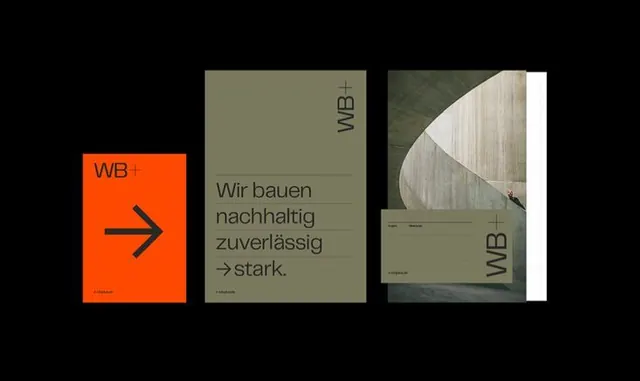
A three-card mockup of a complete brand identity system. The left card features a bright burnt-orange square background with a bold right-pointing arrow in dark blue, labeled with a small lowercase descriptor. The center card shows an olive-green background with clean sans-serif type laid out in a simple, hierarchical arrangement: "WB" monogram at top, a multi-line tagline in gray below. The right card displays architectural photography (concrete structure) with a white sidebar containing the monogram and minimal secondary text. All three cards sit flush against a black background, with small crosshair registration marks at corners. The color palette of orange, olive, gray, and black creates professional sophistication with subtle warmth.
Key takeaway
The combination of a single bold geometric accent (orange arrow) with restrained earthiness (olive-green and grays) signals contemporary corporate confidence without aggression. The arrow serves as a directional, forward-thinking device that works across applications. Mixing photographic and typographic treatments across the suite demonstrates versatility while maintaining visual unity through color constraint.
Reuse notes
Ideal for construction, engineering, and infrastructure brands seeking authority without corporate stiffness. The olive-orange pairing is underused and pairs well with natural or architectural imagery. The geometric left panel works as a standalone icon or pattern across applications. Adjust the photo category for different industries while maintaining the color and type grammar.
More like this




Keep what you find
A free account saves references to boards and can send you a weekly email of picks based on what you save.
To see every result, go Pro.