Preview image. Unlock full-res
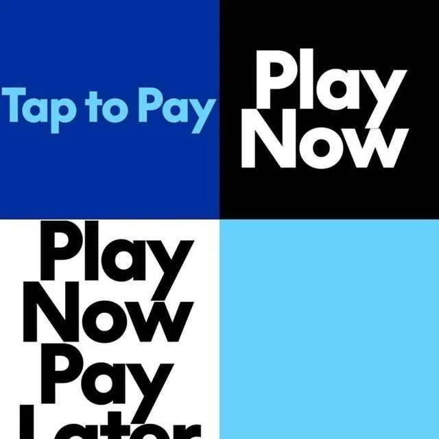
A four-quadrant high-contrast poster showcasing payment and shopping actions via large sans-serif bold typography and primary-color blocks.
Summary
A bold four-quadrant composition combining oversized sans-serif payment messaging against primary-color blocks in royal blue, black, white, and cyan.
Visual description
A divided canvas split into four equal rectangles. Top-left: royal blue background with light cyan text "Tap to Pay". Top-right: pure black background with white text "Play Now" in large, bold sans-serif. Bottom-left: white background with black sans-serif text "Play Now Pay Later" (partially visible). Bottom-right: light cyan background with no text. The typography is thick, confident, and fills its quadrant, creating urgent visual rhythm through color inversion and alternating positive/negative space.
Key takeaway
Color inversion (dark text on light, light text on dark) makes each message pop independently. The equal quadrant grid creates mechanical precision while the bold typography prevents coldness. Oversized text breaks the mold without complexity. The cyan accent color works across all four quadrants as a unifying element.
Reuse notes
Perfect for fintech, payment, or BNPL app marketing. The direct, high-contrast approach reads well at small scale or in print. Works as a poster, billboard, or social card. Pair with a cohesive cyan/blue/black color palette. Avoid for luxury or emotional brands; the stark directness demands utility-forward messaging.
More like this





Keep what you find
A free account saves references to boards and can send you a weekly email of picks based on what you save.
To see every result, go Pro.