Preview image. Unlock full-res
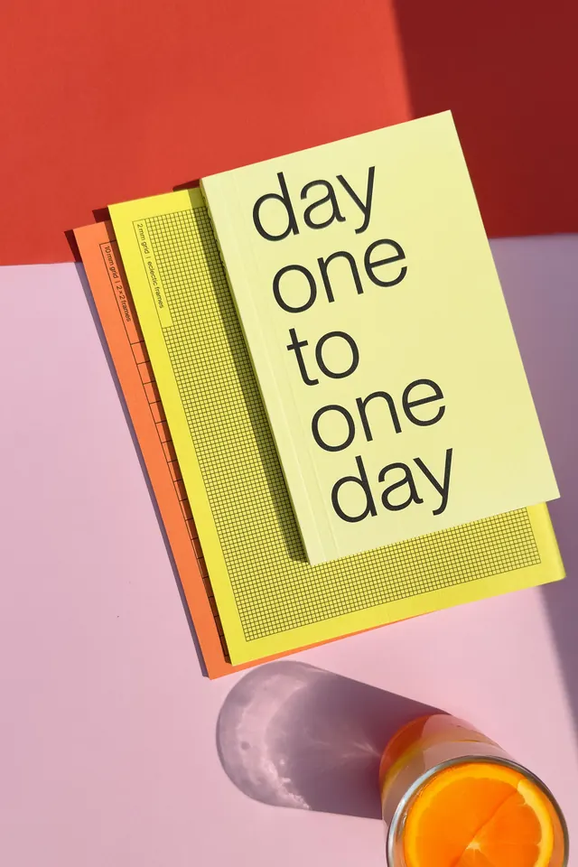
Stacked stationery products layered against a warm background with an orange juice glass, styled with pastel covers in cream, yellow, and coral tones.
Summary
Stacked stationery products layered against a warm background with an orange juice glass, styled with pastel covers in cream, yellow, and coral tones.
Visual description
Four stacked books or notepads in pastel cream, yellow, and muted coral create a diagonal composition. The top cover is cream with dark sans-serif text reading "day one to one day"; below are layered covers featuring a yellow grid-pattern insert and warm orange spine detailing. The background is split between warm salmon red at the top and soft mauve at the bottom, creating a soft color gradient. A freshly cut orange in a clear glass with morning light and shadow sits at the bottom right, anchoring the lifestyle mood.
Key takeaway
The diagonal stack angles the subject into the frame for visual interest. The color blocking across covers and background (warm to cool transition) unifies pastel tones without flatness. The photographic element (juice + glass) grounds the graphic design context in real product styling.
Reuse notes
Strong for stationery branding, planner design, or any packaging that needs a soft, inviting, editorial treatment. The layered composition works well in square crops for social media. Avoid if you need a minimal, flat aesthetic without dimensional depth.
More like this



Keep what you find
A free account saves references to boards and can send you a weekly email of picks based on what you save.
To see every result, go Pro.