Preview image. Unlock full-res
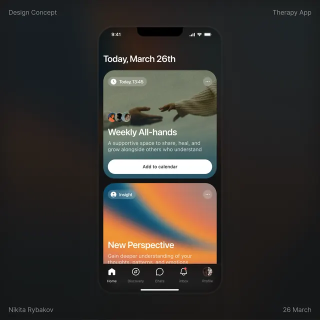
Mobile app interface for a therapy or wellness platform featuring dark mode, gradient accent cards, centered layout with call-to-action buttons, and a five-icon bottom navigation.
Summary
A mobile wellness app interface featuring a dark charcoal background, two stacked content cards with gradient overlays (teal and orange), call-to-action buttons, and a five-icon bottom navigation bar.
Visual description
A vertically-oriented mobile phone mockup displays a dark interface with the date "Today, March 26th" at the top. Two distinct cards are stacked: the upper card has a muted sage-green gradient background with a hand-photograph thumbnail, headline "Weekly All-hands", supporting subtitle text, and a white "Add to calendar" button. Below, a second card features an orange-to-peach diagonal gradient with the headline "New Perspective" and smaller supporting text, creating a visual rhythm through color contrast. At the bottom, a horizontal navigation bar contains five icons (Home, Discovery, Chat, Alerts, Profile) in a neutral tone. All typography is clean sans-serif in white and light gray. Negative space is generous, avoiding clutter.
Key takeaway
The two-card stacking pattern with distinct gradient treatments for visual hierarchy and interest. The use of soft, warm earth tones in dark mode that feel calming rather than clinical. The simple five-icon navigation that doesn't demand cognitive load. The horizontal rhythm created by alternating card colors down the screen.
Reuse notes
Perfect for wellness, meditation, therapy, or mental-health app designs. The dark palette with warm accents creates a supportive, introspective mood without feeling depressing. Works best when cards have genuine content hierarchy, not equal weight. The hand imagery (showing human connection) grounds the abstract interface in approachability.
More like this



Keep what you find
A free account saves references to boards and can send you a weekly email of picks based on what you save.
To see every result, go Pro.