Preview image. Unlock full-res
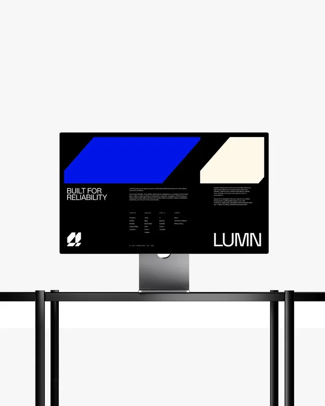
A dark website footer and corporate identity mockup featuring a bright blue parallelogram shape next to a cream offset square, demonstrating striking geometric contrast.
Summary
A dark website footer displayed on a desk monitor, showcasing a brand identity system that pairs a bright blue parallelogram with a cream offset square as the core visual identity.
Visual description
A desktop monitor on a metal desk displays a dark website footer spanning the full width. The footer contains a striking two-color geometric composition: a large bright blue parallelogram on the left side and a cream-colored offset square on the right, positioned at slightly different depths. Below these shapes sits navigation and contact text in white sans-serif type, along with footer links grouped in multiple columns. A simple company logo appears in the bottom left corner as a stylized geometric mark in white. The "LUMN" wordmark anchors the bottom right in large display type.
Key takeaway
The bold use of two contrasting geometric shapes as a brand anchor works immediately. The strict black and white color discipline lets the blue parallelogram feel like the primary brand move. The footer structure (identity element + structured link columns + wordmark) is a reusable pattern for B2B sites needing polish and geometric rigor.
Reuse notes
Strong reference for corporate websites, SaaS platforms, and tech companies seeking a modern footer with strong visual identity. The geometric approach pairs well with sans-serif-only typography. Works best on dark backgrounds where the cream offset reads clearly. Good for brands positioning on precision and reliability.
More like this




Keep what you find
A free account saves references to boards and can send you a weekly email of picks based on what you save.
To see every result, go Pro.