Preview image. Unlock full-res
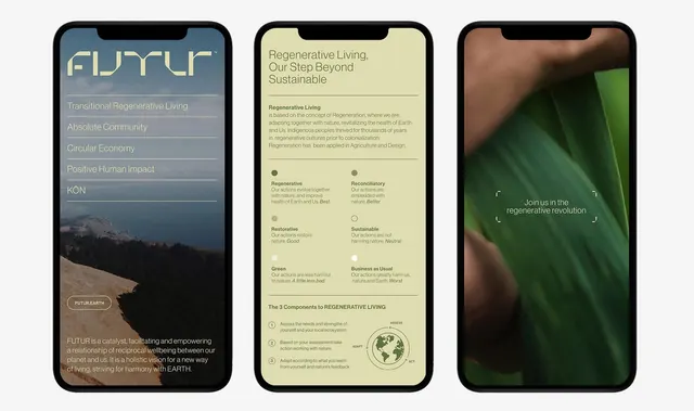
Three mobile mockups showcasing a regenerative-living app with slate-blue and forest-green interface, sustainability messaging, and earth-toned photography.
Summary
Three phone screens for a regenerative-living platform (FUTUR) pairing slate-blue and forest-green UI with cream content cards, nature imagery, and sustainability principles.
Visual description
Three iPhone mockups side by side. Left screen: dark slate-blue background with large serif logo "FUTUR" in beige, followed by content hierarchy—"Transitional Regenerative Living," "Absolute Community," "Circular Economy," "Positive Human Impact," "KON"—in cream type. Mountain landscape photo at bottom with white "FUTUR EARTH" button. Tagline in small cream text. Center screen: cream-colored card on dark background with headline "Regenerative Living, Our Step Beyond Sustainable," followed by body copy and six circular badge-buttons containing concepts like "Regenerative," "Reconciliatory," "Restorative," "Sustainable," "Green," "Business as Usual." Simple earth-line icon at bottom right. Right screen: dark forest-green background featuring close-up nature photography (leaf/organic texture) with white text overlay "Join us in the regenerative revolution" and small corner guides.
Key takeaway
The color tension between deep slate-blue and forest green creates a grounded, nature-connected brand identity without being cliche. Cream content cards against dark UI backgrounds maximize readability and make text-heavy sustainability copy feel digestible. The mix of photography, badge concepts, and white space prevents overwhelming a complex subject matter.
Reuse notes
Ideal for sustainability platforms, nonprofit environmental initiatives, or B2B regenerative-economy services. The dark backgrounds reduce glare on mobile and signal sophisticated, values-driven positioning. Works well pairing dense philosophical copy (left screen) with interactive concept badges (center) and aspirational imagery (right). Less suitable for fast-paced or playful brands.
More like this


Keep what you find
A free account saves references to boards and can send you a weekly email of picks based on what you save.
To see every result, go Pro.