Preview image. Unlock full-res
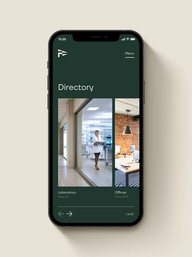
Mobile app directory screen with dark forest-green background, navigation cards showing interior office spaces, and a horizontal pagination slider.
Summary
A mobile app directory interface pairing a rich forest-green background with white sans-serif typography and photographic cards showing office locations and spaces.
Visual description
iPhone mockup displaying a full-screen directory interface. Deep forest green (#20372F) fills the background. At top, a white logo (flag icon) sits left with "Menu" text on the right. A large "Directory" headline in white sans-serif anchors the upper third. Below are two stacked rectangular photo cards showing interior office scenes: the left card displays a corridor and modern workspace with a woman in professional attire; the right shows a brick-wall office with warm pendant lighting and workstation. Underneath each image is a subtitle in small white text: "Laboratory Floor 21" and "Offices Floor 12-17". At the bottom, left-right navigation arrows sit left-aligned with a "1 of 10" counter centered on the right, all in light gray text. The overall composition is centered and vertically stacked, with generous spacing emphasizing the cards as primary content.
Key takeaway
The deep forest-green background paired with cream and beige tones creates a premium, trustworthy feel suitable for corporate or professional contexts. The horizontal card navigation pattern with photo-per-location plus metadata (name, floor) is a clean way to structure directory or location-based browsing. The small "page X of Y" counter signals discoverability without breaking the visual calm.
Reuse notes
Use for internal corporate apps, office directory interfaces, or B2B product tours that need warmth with professionalism. The dark-green-on-cream contrast works best on screens where users spend time; pair with functional UI controls. Photography of actual spaces adds credibility and human context compared to abstract graphics.
More like this








Keep what you find
A free account saves references to boards and can send you a weekly email of picks based on what you save.
To see every result, go Pro.