Preview image. Unlock full-res
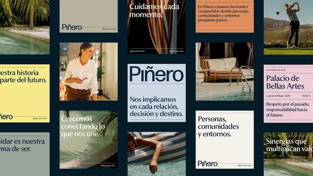
Asymmetric collage-style brand system for Piñero featuring lifestyle photography, typography panels, and warm earth tones with navy and teal accents on a dark grid background.
Summary
Brand identity system for Piñero featuring overlapping panels of lifestyle photography, mission statements in Spanish, and typography samples arranged on a dark navy grid backdrop.
Visual description
An asymmetric collage of rectangular and square panels arranged tightly on a dark navy background. Top-left shows tropical foliage and water; other panels contain lifestyle imagery (woman in neutral clothing, hands holding tableware, golf player, architectural interiors). Typography ranges from serif to sans-serif in display and body weights, setting mission-driven Spanish language statements: "Cuidamos cada momento" (We care for each moment), "Crecemos conectando" (We grow connecting), "Personas, comunidades y entornos" (People, communities, and environments). A salmon-orange panel provides accent color. Bottom panels include wordmark, date information (Palacio de Bellas Artes, Jueves 8 Mayo 2026), and event descriptive copy. Color palette combines warm photographed tones (terracotta, tan, skin tones) with cool brand colors (navy, teal, cream).
Key takeaway
Asymmetric panel arrangement that feels curated rather than rigid, allowing photography and text to breathe independently. The dark background makes warm imagery and cream typography pop without requiring high contrast. Bilingual layout demonstrates how typography hierarchy can organize cross-lingual content naturally within a grid system.
Reuse notes
Effective for hospitality, travel, lifestyle, or nonprofit brands emphasizing community and cultural values. Works well when the brand story involves both visual moments and verbal mission statements. The collage approach suits brands that need flexibility across print and digital without feeling chaotic.
More like this





Keep what you find
A free account saves references to boards and can send you a weekly email of picks based on what you save.
To see every result, go Pro.