Preview image. Unlock full-res
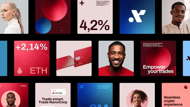
A modular UI grid mixing professional headshots, data visualization tiles, and financial metrics in red, blue, and neutrals for a crypto trading platform.
Summary
A modular UI grid mixing professional headshots, data visualization tiles, and financial metrics in red, blue, and neutrals for a crypto trading platform.
Visual description
A 5x3 grid of UI component mockups and marketing assets for a fintech platform. Left column: color-blocked portrait headshots (diverse individuals) cropped at shoulders against solid color backgrounds (soft pink and cream). Center columns: abstract data visualization tiles with overlapping circles in red and blue gradients; large percentage indicators (+2,144%, 4,2%); a red debit card mockup; UI screens with the brand logo in white on deep blue. Right column: more portrait headshots and text tiles. Repeating elements include a white plus-sign logo/icon, bold sans-serif headlines ("Trade smart, Trade NanoCorp", "Empower your trades", "Seamless crypto experience"), and alternating red/blue/cream backgrounds. Consistent margin and gutter spacing throughout the grid.
Key takeaway
The modular grid system makes diverse asset types (portraits, data viz, text callouts, card mockups) feel cohesive. Red-and-blue split-screen color coding signals action and trust simultaneously. Cropped portrait headshots at generous size humanize a technical platform. Large, positive percentage figures become visual anchors that communicate growth and opportunity.
Reuse notes
Ideal for crypto, fintech, trading, or payments platforms, particularly when positioning toward both retail and institutional users. The portrait strategy works when you have diverse, professional headshots; avoid if talent pool is limited. The color formula (deep red + royal blue + soft neutrals + white text) is strong for enterprise SaaS dashboards too. Red gradients on black backgrounds can feel aggressive; test contrast and legibility at product scale.
More like this



Keep what you find
A free account saves references to boards and can send you a weekly email of picks based on what you save.
To see every result, go Pro.