Preview image. Unlock full-res
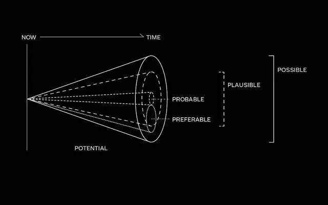
A cone-shaped diagram mapping future states from NOW to POTENTIAL, with branching probability paths labeled PROBABLE, PLAUSIBLE, PREFERABLE, and POSSIBLE.
Summary
A cone-shaped diagram visualizing the range of possible futures across a time axis, branching from a present state (NOW) into four diverging probability zones (PROBABLE, PLAUSIBLE, PREFERABLE, POSSIBLE).
Visual description
Monochrome diagram on black background with white lines and text. A horizontal arrow labeled NOW to TIME anchors the left edge. From the left point, a cone expands rightward with solid, dashed, and dotted converging lines representing different probability paths. Four nested concentric ovals occupy the cone's widest section, each labeled with a different future state. A vertical bracket on the right labels the full cone as POSSIBLE. All text is set in clean sans-serif, aligned center or right.
Key takeaway
The cone shape itself as a metaphor for certainty narrowing over time; the line-weight hierarchy (solid/dashed/dotted) to distinguish probability levels without color; the efficient use of nested curves to show convergence and divergence simultaneously.
Reuse notes
Useful for scenario-planning, strategic foresight, or product roadmap diagrams where you need to show multiple possible outcomes fanning out from a fixed present. Works well in monochrome contexts or black presentations.
More like this




Keep what you find
A free account saves references to boards and can send you a weekly email of picks based on what you save.
To see every result, go Pro.