Preview image. Unlock full-res
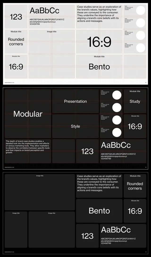
A comprehensive brand guidelines document using a consistent modular grid to present typography, layout, color systems, and design ratios with dual light and dark examples.
Summary
A comprehensive brand guidelines document using a consistent modular grid to present typography, layout, color systems, and design ratios with dual light and dark examples.
Visual description
The composition is split across three sections showing the same design system applied in light and dark contexts. Each section uses a strict modular grid to organize information: sample typography at large scale (AaBbCc 123), detailed letterform and number specifications, layout frameworks (16:9 aspect ratios, bento grid compositions, rounded corners notation), and body copy sections. The light version uses white backgrounds with black type; the dark version inverts to near-black with light gray type and white circular accent elements. Consistency is enforced through aligned grid cells and repeated component labels (Module title, Image title, 16:9 ratio markers).
Key takeaway
The dual-theme documentation pattern: showing both light and dark versions side by side (or stacked) immediately surfaces accessibility and theme switching requirements. The modular grid itself becomes part of the design specification, reinforcing rhythm and alignment rules. Using consistent typography samples and ratio annotations as headers guides implementers.
Reuse notes
Ideal for design-system or brand-guidelines PDFs, especially those targeting both screen and print use. The grid-based structure is particularly effective for communicating layout rules to development teams. Works well as a page template for larger brand-book documents.
More like this
Keep what you find
A free account saves references to boards and can send you a weekly email of picks based on what you save.
To see every result, go Pro.