Preview image. Unlock full-res
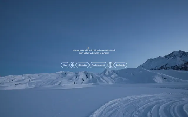
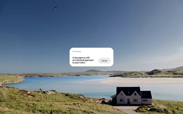
A photographic snowy landscape background with cool blue sky gradient, overlaid with service value proposition text and pill-shaped navigation buttons in a minimalist layout.
Summary
A snow-covered landscape with blue-gradient sky serves as the hero background for a visa services site, with centered service copy and six pill-button navigation items in a restrained, trust-forward composition.
Visual description
Background is a full-bleed photograph of a snowy mountainous landscape occupying the lower two-thirds, with a clear blue sky gradient (pale at horizon, deeper indigo overhead) in the upper third. In the center, positioned above the horizon line: centered white sans-serif body copy reading "A visa agency with an individual approach to each client with a wide range of services". Below the copy, a horizontal row of six pill-shaped button outlines (stroke-only, no fill) with text labels (Home, Visa, Consulate, Sponsorship, Flights, Tour Guide or similar) in white sans-serif. The buttons have minimal styling and even spacing, grouped as a cohesive navigation bar.
Key takeaway
The photographic background creates emotional trust through scale and naturalness while the minimal overlay (light text, outline buttons) maintains clarity and professionalism. The pill-button design keeps navigation accessible without visual weight. Horizontal button grouping at a single focal point prevents information scattered across the frame. The color harmony between the cool landscape and the body copy keeps the hierarchy unified.
Reuse notes
Strong choice for travel, immigration, or any service-sector hero where trust and scope matter more than product drama. The snowy landscape suggests expansiveness and reliability; works well for regions marketing or visa-related businesses. The pill-button style is mobile-friendly and scannable. Caution: overlay text can lack contrast if the photo is lighter in the center; test on the actual background photo. Works best with a single short value proposition and a narrow navigation row; too many buttons or longer copy will crowd the page.
More like this




Keep what you find
A free account saves references to boards and can send you a weekly email of picks based on what you save.
To see every result, go Pro.