Preview image. Unlock full-res
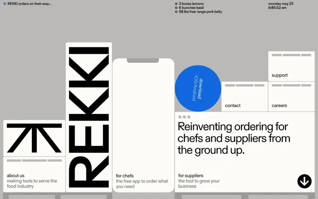
B2B ordering platform interface for REKKI using a bold black geometric wordmark, monochrome grid layout, and bright blue accent for product calls-to-action across three customer segments.
Summary
The REKKI ordering platform uses a stark black wordmark logo and monochrome modular grid to segment messaging for three audiences (about us, for chefs, for suppliers), with a bright blue accent button centralizing the value proposition.
Visual description
The layout is anchored by a bold black geometric wordmark ("REKKI") on the left side, composed of angular, stylized letterforms with interlocking triangular elements. To the right, three distinct content zones sit in a structured grid separated by thin gray lines: "about us" on the left with descriptive copy, a central white card presenting the headline "Reinventing ordering for chefs and suppliers from the ground up," a bright blue circular badge with white text stacked in the center, and a right column offering "support," "contact," and "careers" links. The palette is strictly monochrome (black, white, light gray) with a single bright cobalt-blue accent. A simple sans-serif typeface provides legible hierarchy across all text. The background is a neutral warm gray. Small icons and text sizes define secondary information clearly.
Key takeaway
The black geometric wordmark with angular interlocking strokes feels modern and technical. The modular grid with thin line separators creates visual breathing room while maintaining strict column discipline. One bold accent color (bright blue) on an otherwise neutral palette instantly draws focus to the primary call-to-action without visual noise.
Reuse notes
Ideal for B2B software, food-service platforms, and logistics tools where clarity and professionalism are non-negotiable. The three-column segmentation strategy scales to any multi-segment audience. Monochrome base with single accent color works across both print and digital, from landing pages to PDF exports.
More like this




Keep what you find
A free account saves references to boards and can send you a weekly email of picks based on what you save.
To see every result, go Pro.