Preview image. Unlock full-res
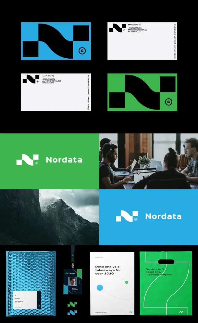
A geometric brand system for Nordata using a wave-form icon as the centerpiece, applied across business cards, patterns, and photography with bright cyan and lime green.
Summary
Nordata's corporate identity system centers a modular wave icon in bright cyan and lime green, applied consistently to business cards, environmental graphics, and team photography.
Visual description
A nine-panel system showing the wave icon in 3x3 grid with different color treatments: cyan on black, white on black, lime green on white/black combinations, and the full icon as a negative space element. Business cards with logo and team photography sit alongside brand collateral: a lime green environment with white logo, a cyan section with brand name, landscape photography with cyan accent, and a green-field pattern demonstration with wave applied as a line art graphic. Sans-serif typography in white and dark gray throughout, with generous spacing and consistent grid alignment.
Key takeaway
The modular nature of the wave icon: it works as a solid form, a line element, a positive mark, and a negative space device. Color flexibility within a tight primary palette (cyan/lime on black/white/dark). The application across both static collateral and photographic contexts shows system maturity and versatility.
Reuse notes
Strong model for technology, software, or consulting brands needing geometric, approachable identity. The cyan-green combination reads as forward-thinking without being trendy. Minimal type weight keeps the icon central. Works well in presentations, environmental graphics, and digital products.
More like this







Keep what you find
A free account saves references to boards and can send you a weekly email of picks based on what you save.
To see every result, go Pro.