Preview image. Unlock full-res
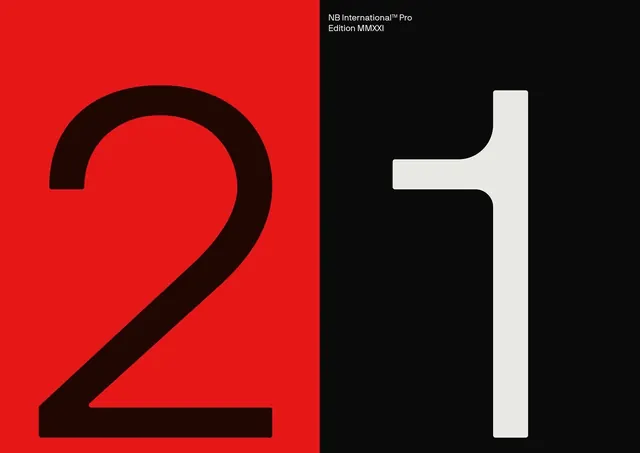
A bold type specimen showing a large dark "2" on bright red and a large light "1" on black, split-field composition emphasizing contrast.
Summary
A striking type specimen using split-field composition: a large bold "2" on bright red paired with a large bold "1" on black, with a small label identifying the typeface family.
Visual description
The left half is bright red background with a thick, dark sans-serif numeral "2" dominating the space. The right half is solid black with a light-colored "2" in matching style. A small label in the upper right corner identifies the typeface. The composition uses pure color blocking and maximum contrast to showcase the typeface weight and proportions.
Key takeaway
Split-field color blocking emphasizes type weight by eliminating background noise. High contrast makes the numerals readable at any scale while creating a bold, modern aesthetic.
Reuse notes
Strong reference for typeface presentation, brand identity guidelines, and bold editorial covers. The pure color approach works for tech brands and minimalist design systems that need confident typography expression.
More like this


Keep what you find
A free account saves references to boards and can send you a weekly email of picks based on what you save.
To see every result, go Pro.