Preview image. Unlock full-res
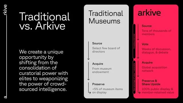
High-contrast black, white, and hot-pink comparison poster contrasting traditional museum curatorial structures against a decentralized archive model with parallel column typology.
Summary
A stark comparison poster using three vertical columns (dark background, centered light card, hot-pink accent card) to juxtapose curatorial governance with decentralized acquisition, preservation, and knowledge-sharing models.
Visual description
Black background with vertical left edge type reading "arkive" and "ad" in small caps. The left third contains an oversized two-line headline in white sans-serif ("Traditional vs. Arkive") and a three-sentence statement about power consolidation and curation. The center column is a light gray card with three labeled sections (Source, Acquire, Preserve) each followed by a short descriptor and a horizontal guide line. The right column is a saturated hot-pink card with matching labels and shorter white text blocks, each section marked with a solid right-edge accent line. Typeface throughout is clean, modern, and geometric. Strict grid structure creates immediate visual hierarchy and parallel readability.
Key takeaway
The effective use of a single bold accent color (hot pink) and stark tonality to signal institutional opposition without illustration. The parallel column structure makes comparison inevitable and cognitive load light. The right-edge weight lines and internal dividers create visual rhythm without ornament.
Reuse notes
Strong template for organizational or institutional comparisons. Works best when the two entities are genuinely opposed (traditional vs. decentralized, legacy vs. new, etc.). The hot-pink accent reads as disruptive against the black/white; pick an accent color that signals the axis of comparison. Scale the typography to match audience (this is presentation-grade legible even at small sizes).
More like this




Keep what you find
A free account saves references to boards and can send you a weekly email of picks based on what you save.
To see every result, go Pro.