Preview image. Unlock full-res
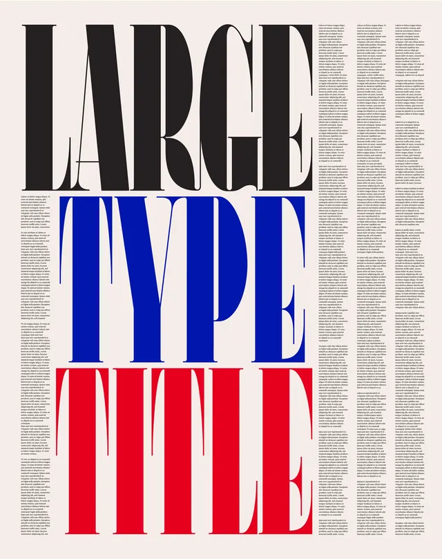
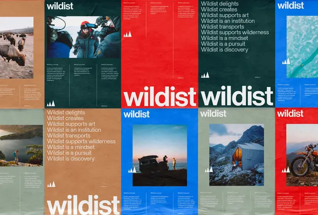
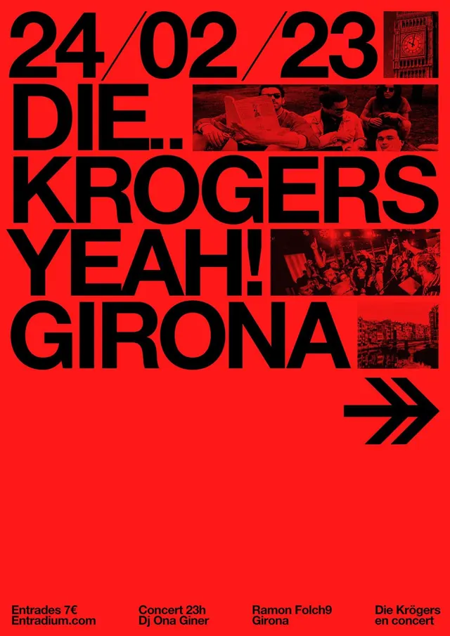
Large-scale editorial typographic design with oversized sans-serif letters stacked in black, blue, and red against columns of body text.
Summary
An editorial layout with three stacked typographic blocks: "BOLD" in black, "INDEPENDENT" in electric blue, and "LIFE" in bright red, each overlaid with justified body text columns.
Visual description
Full-page editorial layout divided into three horizontal sections, each containing oversized sans-serif type (all-caps) in a different color: black at top, blue in middle, red at bottom. Each section is overlaid with 3-4 columns of small justified body copy (the text is legible but not the primary focus). The letters are extremely large, filling most of the vertical space per section, and the font has a geometric, modern sans-serif character. The color transitions are clean and sharp. White negative space appears between and around letterforms. The body text uses a smaller sans-serif in dark gray or black. Overall composition demonstrates strong typographic hierarchy through scale and color blocking.
Key takeaway
Oversized type as a design element itself, with supporting body copy creating a secondary layer. The three-color system (black/blue/red) provides visual rhythm and guides reading flow downward.
Reuse notes
Excellent reference for magazine spreads, manifestos, policy documents, or any long-form editorial needing visual interest. The color-blocking system is scalable to any topic and any number of sections. Requires generous white space and careful text selection to prevent clutter. Works best when printed large; digital usage should maintain adequate type sizes and contrast.
More like this

Keep what you find
A free account saves references to boards and can send you a weekly email of picks based on what you save.
To see every result, go Pro.