
Preview image. Unlock full-res
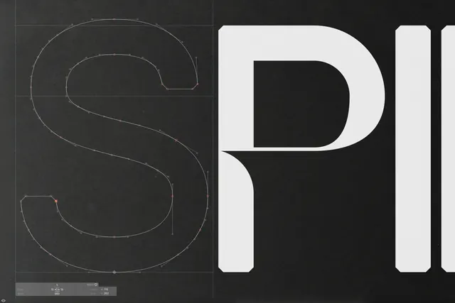
Type specimen carousel for Stack Sans, a modernist sans serif font with distinctive notched detailing, shown across weight variations and use cases.

Summary
A four-slide type specimen showcasing Stack Sans, a modernist sans serif font created for Stack Overflow, featuring its signature notched detailing and full weight range from Extralight to Bold.
Visual description
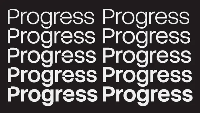
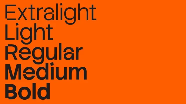
Slide 1: Bold orange background with black "Stack" logotype and construction grid showing the notched character details and anchor points. Slide 2: Dark background with white type setting the word "Progress" repeated in a grid layout, demonstrating the font's even rhythm. Slide 3: Split composition with text "Part. Sum. Solution." in a dark box on beige background, paired with abstract geometric striped forms in yellow and orange. Slide 4: Orange background with all weight variants listed vertically in black sans serif: Extralight, Light, Regular, Medium, Bold, each displaying the weight progression with consistent character proportion.
Key takeaway
The notched details and construction-line approach teach a lesson in signature design. The full weight range presentation in a single frame shows how systematic families maintain optical consistency across weight shifts while preserving distinctive character.
Reuse notes
Strong reference for type-system design and font specimen layouts. The construction-grid slide is useful for showing design process and geometric thinking. Effective for brand guidelines or font marketing, especially when emphasizing craft and modernist roots. Works well as a portfolio piece for typographic thinking.
From this post: Stack Sans typeface specimen
View post

More like this
Keep what you find
A free account saves references to boards and can send you a weekly email of picks based on what you save.
To see every result, go Pro.