Preview image. Unlock full-res
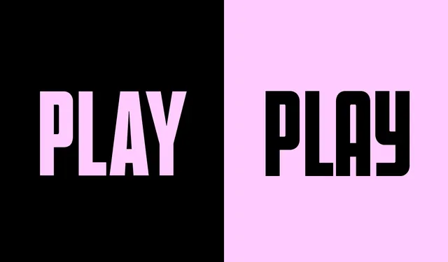
Split-screen type specimen showing "PLAY" in two weights: condensed on a black background and extended on a bright pink background, both in bold sans-serif.
Summary
A stark typeface specimen sheet displaying the word "PLAY" in two contrasting presentations: a condensed version on black on the left, and an extended version on hot pink on the right.
Visual description
A horizontal split layout: the left half shows bright pink letters spelling "PLAY" in a tight, condensed, all-caps sans-serif weight against a black background. The right half mirrors the composition with black letters in an extended, wider weight against a bright pink background. The typeface is geometric, clean, and modern, with stark optical contrast achieved entirely through background color swap.
Key takeaway
The simple color-reversal comparison is an effective way to showcase weight variation and legibility across background contexts; the stark high-contrast palette makes the letterforms the sole focus.
Reuse notes
Ideal for typeface foundries or type design portfolios. The split-screen comparison is a classic technique for showing type specimens across contrasting colors. Works for marketing font families.
More like this
Keep what you find
A free account saves references to boards and can send you a weekly email of picks based on what you save.
To see every result, go Pro.